
A small area, just a few pixels wide, but with immense significance: the CTA (Call-to-Action) in an email can single-handedly determine the success or failure of your campaigns.
Along with the subject line, the CTA is the most extensively tested component by email marketers. This isn’t surprising when you consider that it is the primary driver of conversions in your campaigns. Therefore, it’s essential to give it special attention.
Fortunately, the Button element in the Dartagnan email builder is a native feature that allows you to create highly effective CTAs. However, mastering its principles is crucial.
Size, color, shape, text… Here’s our 12-point checklist to help you achieve this.
| Need advice on optimizing the design of your campaigns and boosting the performance of your email marketing strategy? Contact Dartagnan’s experts. |
1. The type of your CTA in Email: button over link
One of the key principles of UX Design is to adhere to the concept of affordance. In simple terms, the shape of an object can suggest its function. For instance, the icon of an envelope indicates that it’s for sending mail, a right-facing arrow suggests moving forward, a left-facing arrow implies going back, and so on.
Button = Click
Similarly, an underlined text, especially if it’s in blue, signals that the text is clickable.
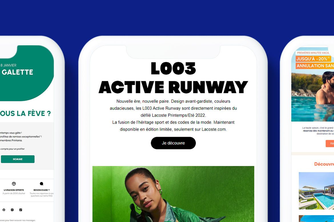
However, buttons take the identification even further. Due to our daily interactions with digital environments, the presence of a button in any interface instinctively invites clicking.
Is a button more enticing than a “simple” underlined link? Most tests on this topic suggest so. For instance, in one study, a button resulted in a 45% higher conversion rate compared to a link.
So… Button or Link?
For hierarchy and readability reasons, it is recommended to alternate between buttons and links.
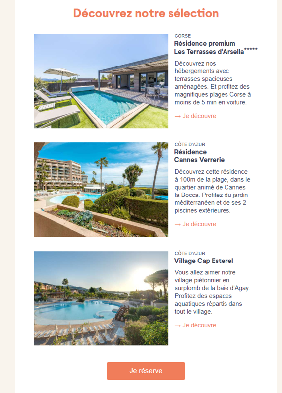
This email from Pierre & Vacances is a good example:
- The use of “Discover” links helps to lighten the design
- The lighter links direct users to a specific destination, while the more prominent “Book Now” button leads to the reservation page for all destinations.
2. The shape of your CTA in the email: square, rounded, or “pill”?
A call-to-action is most often a rectangle containing a call-to-action message, with three possible shapes: square corners, slightly rounded corners, or half-circle (pill) shapes.

Be consistent with your brand identity
There is no absolute rule when it comes to choosing the shape, except for what is dictated by your own brand guidelines.
Align the email experience with the web experience (when possible) and:
- Select buttons that match those found on your website
- Use the same button style throughout your email
Be consistent in your design
To ensure that your CTA is visually consistent and appealing:
- Avoid placing a single word in a very large clickable area.
- Avoid splitting the text content of your button across two lines.
Your CTA should strike a balance between readability and focus.
Looking to make a lasting impression with innovative emails? Explore the design features of the Dartagnan Email Builder.
| Looking to make a lasting impression with innovative emails? Explore the design features of the Dartagnan Email Builder. |
3. The size of your CTA in the email: big (but not too big)
Is it true that the bigger your CTA (Call to Action) in the email, the more visible it is, and therefore the more likely it is to be clicked? Not always! What is certain, however, is that size matters. Especially in the mobile responsive version, where the goal is to make it as easy as possible for mobile users.
In short, if you want to maximize your conversion rate and improve your email marketing performance, you can take inspiration from the following guidelines.
Between 35 and 45 pixels
Here are the main recommendations for the minimum size of call-to-action buttons according to Apple (iOS), Google (Android), Microsoft… and a laboratory at MIT that studied the “tap surface” of an average human index finger.
How big sould a CTA be on mobile?
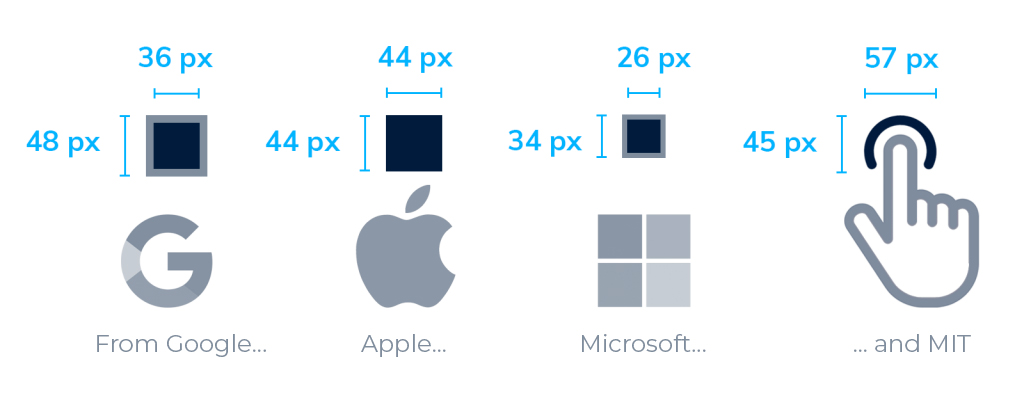
Dartagnan’s recommendation? Design your buttons with a height between 35 and 45 pixels. However, for the sake of hierarchy among your CTAs, you can go down to 30 pixels in height.
Think about accessibility and compatibility
If you are concerned about email accessibility, you can go up to a height of 50 pixels. This will make it easier for people with visual impairments to identify your CTAs in your emails.
You can also choose to determine the width of your CTAs in percentages rather than pixels: this will allow your buttons to adapt to the screen sizes of the devices where your emails will be displayed.
4. Formatting your CTA: directing the eye to your Call-to-Action
To enhance the visibility of your buttons, you can use two complementary design methods:
- Whitespace usage (the “white” or empty space around your CTA that allows it to stand out more clearly).
- Visual cues: lines, arrows, or the gaze of a character directed towards the CTA, icons or arrows within the CTA itself (as demonstrated by Petit Bateau, below)… These tricks effectively guide your recipient’s eye toward your button.
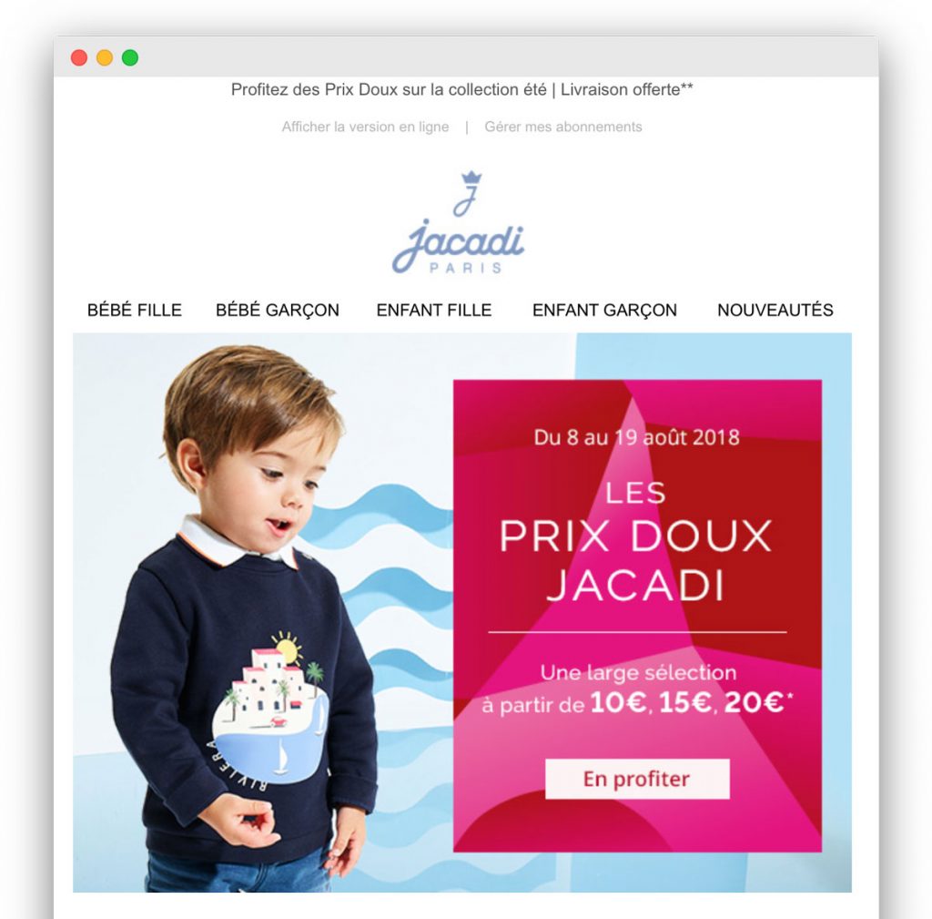
Here are two examples of visual cues to draw attention to a CTA, from Jacadi and Petit Bateau. (Click on the images to see the full emails)
5. The color of your CTA in the email: embrace contrast
There is no one-size-fits-all color for a call-to-action. However, there are guidelines to follow when choosing the hue that best suits your campaign, starting with adhering to the color palette defined in your brand’s style guide.
Contrast is the Key
The ultimate weapon in CTA color is contrast. Take a look at the three buttons below:

CTA (dark blue) on a light gray background, the left one stands out much better than the center one (even though the range of blues is quite harmonious). However, it’s the one on the right that immediately catches the eye. The reason? The contrast between the blue button and the yellow-orange background is maximum because both colors are complementary.
Light on dark (or vice versa), or complementary on complementary (blue on orange, red on green, yellow on purple)… it’s the relationship between colors that will have the most impact on your call-to-action.
The Dark Mode is a Trap
Sometimes, the colors of your CTAs can be altered by dark mode: they can lose visibility and legibility.
We recommend testing your CTAs in the email at the time of integration to check and adjust your color choices based on the display.
However, keep in mind that dark mode accounts for approximately 15 to 20% of displays. It’s significant but not enough to completely outweigh your choices, in case you’re unsure about making changes.
In summary, with dark mode, you do your best.
6. The position of your CTA in the email: scrolling over height
The concept of the “fold” or “waterline” inherited from the era of print newspapers is still deeply ingrained in the minds of designers. What’s above the fold:
- Appears as soon as the email is opened,
- Has a better chance of being seen,
- Is therefore perceived as more important by the recipient.
On the other hand, what’s below is considered secondary, or even invisible…
The Fold is Over
At Dartagnan, we believe that the concept of the fold is no longer as relevant.
Today, 41% of email views come from mobile devices compared to 39% from desktop (source: HubSpot blog). Therefore, the design of your campaigns must necessarily accommodate mobile constraints.
However, there are so many different devices (and screen sizes) that it’s difficult to determine with certainty where this waterline will be and, consequently, the exact position to assign to your main CTA.
Instead of thinking about the position of your CTA in terms of height, we suggest thinking about it in terms of scrolling.
Fold vs. Thumb
In an intriguing article titled “How to design for thumbs in the era of huge screens,” designer Scott Hurf notes that one out of every two people uses their smartphone with just one hand. And they navigate using only their thumb.
This was relatively easy with early smartphones. However, with the giant screens of devices like the iPhone 6 Plus or XS Max (added by us in this diagram), it becomes quite a physical feat!

Thumb Navigation: Easy Access Areas (in green), Stretch Areas (in orange), and Inaccessible Areas (in red), Depending on Smartphone Size. Image Source: Scott Hurf
Want your CTA to be easily accessible? Aim for the “foot” of the first screen.
Higher is better, with one small caveat: we’ve all developed the scrolling reflex by now. This doesn’t necessarily mean you should move your main CTA down, but it’s enough to prioritize the design consistency (desktop & mobile) of your campaign.
7. The frequency of your CTA: less is more?
Is it true that by increasing the number of call-to-action buttons, and thus the opportunities to click, you inevitably increase your chances of conversion? False.
When faced with an email that looks like a “Christmas tree,” the recipient encounters a rather formidable cognitive bias: analysis paralysis (the “obstacle refusal” generated by an overabundance of choices).
Your job, therefore, is to reduce the number of offers (and thus CTAs in the email) to a minimum.
Prioritize your propositions
Is it necessary for one email to have one and only one clear proposition? In the context of a CRM program and email marketing in general, it’s not always easy to adhere to this principle.
The solution is to prioritize your messaging: one in the spotlight, a few secondary, and even some tertiary.
Use different CTA designs based on their importance:
- A prominent “solid” button, easily visible and strategically placed for the main offer of your email.
- One or more “ghost” buttons (with a border but no background color) for less important offers.
- And perhaps simple underlined links for accessories or less critical elements.
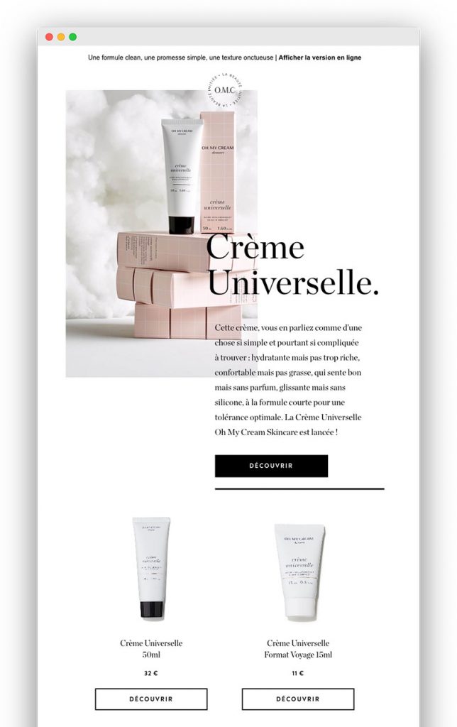
In this Oh My Cream newsletter, you can easily distinguish the main proposition from the secondary ones at first glance. (Click on the image to see the full email)
8. The text of your CTA: precise, concise… and not too intimidating
We know it well: with just a few letters, crafting the text of a call-to-action is not an easy task. We often end up using the same phrases like “Learn More,” “Buy,” “View Product,” and so on. However, it’s possible to be more creative and, most importantly, more convincing!

Be Explicit
The number one job of the text in the middle of your button, which attracts all the attention? To very precisely explain to the recipient what will happen when they click:
- Where will they land: on a product page, a landing page, an editorial, a video?
- What options will they have at their destination: view different colors of a clothing item, compare gaming consoles, discover a paradise hotel?
- What do you expect from them next: to purchase (right away), to reserve, to compare?
Your campaign’s recipient doesn’t have this information, so it’s up to you to give them a glimpse of what awaits on the other side of this virtual entry door that is your CTA.
Club Med “breaks down” the strengths of one of its resorts into multiple promises (and multiple CTAs in the email). (Click on the image to see the full email)
Be Diplomatic
One product, one “Buy” button: simple, clear, and precise, right? But that might be jumping the gun a bit. The goal is to make a sale, but your recipient may not necessarily want to go straight to the purchase.
In reality, opting for less commitment-oriented CTA labels that give the impression of offering more freedom is often a good strategy. Here are a few examples:
- By changing its old CTA (which displayed the price of a car) to a more conservative “View Details,” L’Argus increased its click-through rate by 574%.
- Pierre et Vacances, by replacing “Book” with the less sales-oriented “Check Availability,” actually increased its sales by 14%.
The lesson? “View the product,” “Discover the collection,” “Compare colors” can be more effective than the very (too?) direct “Buy now.”
Be Personal
Your action verb: -er, -ez, or in “I”? E-commerce businesses tend to favor the infinitive form. However… Tailoring your call-to-action so that the recipient feels like an active decision-maker can significantly increase conversions.
“I,” “My,” and “Me” are little nudges to use (or at least test). An example to convince you: in one A/B test, changing “Start your free trial” to “Start my free trial” resulted in a 90% increase in conversions.
Sometimes, Be Silent!
The examples mentioned earlier prove one thing: the few words accompanying the call-to-action in an email are crucial. What these tests don’t tell you is that you can also do without words when necessary.
You can save on words if, for example:
- Your proposition is self-evident and doesn’t require subtitles.
- Your email contains a large number of products or offers, and having a bunch of CTAs in the email might overwhelm your recipient.
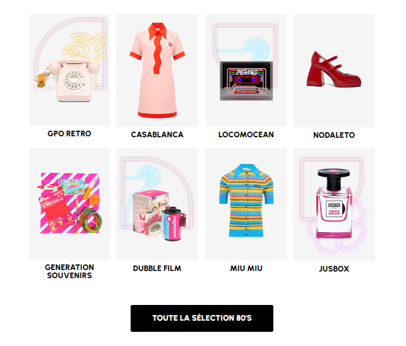
This email from Le Printemps illustrates this perfectly: for its 80s product selection, Le Printemps opted for clickable images and a generic CTA rather than individualized CTAs. This lightens the composition and makes it much more effective:
9. The technique of your CTA: beware of images!
Designing your CTAs as images is a common practice, but it can cost your email campaigns valuable conversion points. In many configurations, images may not display, and you should at least provide alternative text.
“Bulletproof” Buttons to Display in All Contexts
The alternative? Code your CTAs in HTML so that they resemble a button without needing to call an image. These are called “bulletproof buttons” because they will display in all configurations with the same design.
For example, see how the same Evaneos call to action will appear on desktop, mobile, or when images don’t load:
Good to know: with Dartagnan’s email builder, your campaign buttons are “bulletproof” without needing to code them yourself.
10. The interactivity of your CTA: draw attention to your value proposition
By adding a Hover State, you make your CTA in the email dynamic and draw all the attention to your value proposition.
This handy trick is easily achieved in Dartagnan since the Hover State is a native feature in our designer and therefore very easy and quick to implement!
Here’s proof in the image with this stunning email from Maison Kitsuné:
11. Verifying your CTA: before AB testing, the blurriness test
You’ve followed the 8 steps above and are ready to send your email campaign with a brand new CTA? There’s one last little test to do before including your new button and a control version in an AB test (a practice we highly recommend): the blurriness test.
Convert your email into an image, apply a high level of blur, and look at it with fresh eyes: is it well-structured? Is the main CTA clearly visible and prominent?
This test is very useful for simulating a “diagonal” reading of your campaign. If it passes the blurriness test with flying colors, it has a good chance of grabbing the attention of even your most skimming recipients.
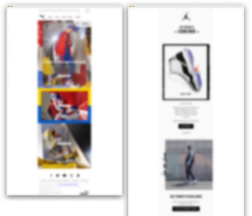
Two campaigns from two competing brands: it’s not necessarily the most colorful one that passes the blurriness test the best…


Aucun commentaire pour l'instant