
Let it be known: Email accessibility is not a trend, it’s a standard!
Designing accessible emails means designing them to be readable and/or understandable by everyone, including individuals with visual, cognitive, or motor impairments.
With nearly 1 billion people with disabilities worldwide, accessibility is no longer a trend but simply a necessary practice in designing email campaigns as well as any other content. Why?
Firstly, because content should always be inclusive, respect diversity, and be accessible to all. And in doing so, reach the widest possible audience…
Secondly, because the accessibility of your campaigns is also a determining factor in their performance.
Challenges and best practices: Dartagnan explores the topic thoroughly for you.
| Need advice on optimizing the performance of your email marketing strategy and the quality of your campaigns? Look no further and rely on our experts. |
Accessible Emails: More than a Trend, a Standard!
Understanding what an accessible email entails
Digital accessibility involves making online services accessible to people with disabilities, whether it’s a permanent or temporary disability.
When it comes to emails, ensuring accessibility means providing an optimal user experience and enabling anyone, regardless of their physical, mental, and cognitive abilities, to open an email, understand its content, and interact with it.
This involves designing campaigns that can be used by assistive technologies such as screen readers.

Who are the individuals affected by accessibility issues?
Motor, visual, auditory, and cognitive impairments: In France, nearly 12 million people are currently affected by disabilities.
In the US, 1 in 4 people is in a situation of disability, amounting to nearly 60 million individuals.
Globally, it is estimated to affect close to 1 billion people.
In addition to these estimates, there are also individuals who experience temporary disabilities, regardless of the reason.
Why has accessibility become an essential part of your email marketing strategies?
Apart from the fact that digital accessibility has now become a legal requirement, it ensures access to information for everyone. Therefore, it is a concern for everyone, especially for any brand that subscribes to the values of inclusion.
In practice, only a few teams currently take accessibility into account when designing their campaigns, and that is a strategic mistake.
En effet, développer des emails accessibles impacte positivement les performances de vos campagnes. En adoptant des règles simples, vous maximisez vos chances de toucher une audience plus large car ces dernières seront plus structurées, claires et compréhensibles.
Developing accessible emails has a positive impact on the performance of your campaigns. By adopting simple guidelines, you maximize your chances of reaching a broader audience because your emails will be more structured, clear, and understandable.
Furthermore, internet service providers (ISPs) consider the quality of email construction in their evaluation. Considering accessibility also means increasing your deliverability rate.
The accessibility of your emails: a true added value for campaign performance
Making your emails accessible ensures better performance, and here’s why.
💥 Making your emails accessible allows you to reach 100% of your audience
In your database, there are inevitably people with disabilities, whether their situation is permanent or temporary.
Failing to guarantee the accessibility of your emails means consciously depriving yourself of a portion of your audience!
Furthermore, by making it accessible for everyone to interact with your content, you inevitably increase your engagement rate and email click-through rate.
Conversely, if a person cannot read or interact with your content, not only will it be of no use to the performance of your campaigns, but you also run the risk of seeing a sharp increase in bounce rate and unsubscribes.
In short, accessibility is beneficial for engagement and loyalty.
Dans votre base de données, il existe nécessairement des personnes en situation de handicap, que cette situation soit permanente ou temporaire.
| Are you looking to accelerate the performance of your email marketing strategy? We will explain how to achieve it with Dartagnan. |
💥 Working on the accessibility of your email campaigns improves the user experience
The set of rules and best practices that ensure the accessibility of your emails benefit the overall user experience of your campaigns.
Enhancing the readability of your content makes it more accessible and engaging, not only for people with disabilities but for your entire audience.
Improved readability and a better user experience also guarantee higher engagement, retention, and conversion rates.
💥 The accessibility of your emails is a genuine differentiation strategy
With nearly 92% of consumers considering it important for companies to act responsibly, making the effort to build accessible email campaigns becomes a true differentiating strategy compared to your competitors.
Moreover, 99% of email campaigns tested on this matter (meaning virtually all of them) still have significant optimizations to make regarding accessibility.
The more proficient you become in this aspect, the greater the chance you have to stand out among the relevant audience and subsequently retain the loyalty of the people you have reached.
| To differentiate yourself, you can also leverage your brand values and commitments, and we’ll explain how to highlight them. |
How to improve the accessibility of your emails?
Accessibility may seem like a highly technical matter that requires significant effort. However, there are a series of best practices that are easily accessible!
💥 Make your copywriting a model of readability
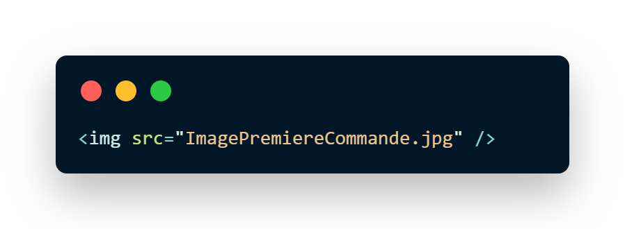
Rule #1: Pay attention to the alt text in your emails
Provide descriptive and precise alt text for your images. Also, make sure to differentiate them for each element in your campaign. There’s no need to apply alt text for purely decorative visuals unless there is a link associated with that image. In that case, either provide the alt tag or remove the link altogether.

On this image, the alt tag is well-filled, and the screen reader will read: “Photo of the basketball with the offer of 10% off your first order.”

On this image, the alt tag is missing. The screen reader will read: “content, image, Imagepremièrecommande.jpg.”
Rule #2: Less is more
Objects, pre-headers, headings, subheadings, paragraphs, button labels—make sure to be clear and concise. This principle contributes to the accessibility of your campaigns, but it is also a golden rule in copywriting and user experience. In short, it’s a win-win situation at all levels. Avoid using overly technical terms and jargon: once again, everyone will thank you.

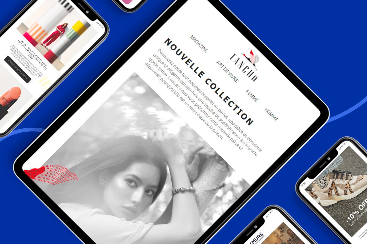
Rule #3: Avoid full-image emails
To ensure that your email is readable and accessible to all, it is advisable to avoid emails that are entirely image-based and add text sections whenever possible. There are no hard and fast rules, but for accessibility, a general guideline is to maintain a balance of 60% text and 40% image. Here’s a helpful tip: avoid visuals that include text within the image itself (in this regard, background visuals can be a useful trick).
Rule #4: Adapt your text
Sitting between the practice of copywriting and design, adapting your text involves:
- Considering accents on uppercase letters to facilitate understanding by screen readers
- Paying attention to line spacing and letter spacing to enhance readability. The recommended line height is at least 1.5 times the font size
- Using bullet-point lists when appropriate
- Ensuring a logical reading order (left to right, except for certain specific languages)
- Maximizing left alignment for your elements and avoiding justified alignment

💥 Utilize your design for accessibility
Rule #5: Give your email room to breathe
Differentiate and space out the various sections of your email by utilizing whitespace (Whitespace is Design). Opt for short paragraphs and provide spacing between your text blocks. The spacing between paragraphs should be at least 2 times the font size.
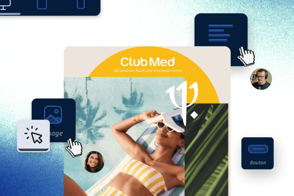
Rule #6: Structure your elements
Organize your content with different elements (images, videos, subtitles) to enhance readability. Make use of headings and subheadings as design elements and play with their sizes to prioritize your information.
Rule #7: Choose the right font
Select a legible font. Avoid decorative, too thin, or overly unique fonts. A font size below 14 px requires extra effort to read. If your font is thin, increase it to at least 16 px.
Rule #8: Check your contrasts
The contrast between text color and background color is crucial for the accessibility of your emails. The contrast ratio between text/image (or background) should be greater than 4.5:1 or 3:1 for text larger than 23px.

Rule #9: Highlight your CTAs
Design clickable action areas that are large, avoiding the need for precision.
Your CTAs are your primary driver of performance and engagement in your emails:
- Provide detailed labels for your CTAs. For example, on a section highlighting your catalog, prioritize “Browse the catalog” over “Click here
- Design clickable action areas that are large, avoiding the need for precision

Rule #10: Pay attention to your dynamic elements
GIFs, videos, and other dynamic elements require special attention.
GIFs are generally not highly recommended. However, they are an interactive element that can enhance the performance of your campaigns. Their use depends on the goals you set for your campaign.
If you want to ensure an interactive experience for your entire audience, avoid using excessively fast or colorful GIFs. When it comes to videos, add subtitles when necessary. Ideally, provide a transcription as well.
💥 Aim for the most accessible HTML code
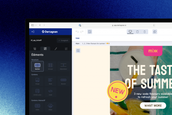
Rule #11: Seek the help of an expert, seek Dartagnan’s assistance
When it comes to coding, it is best to ensure that your Email Builder adheres to a set of accessibility standards.
Dartagnan, in particular, simplifies the creation of accessible campaigns. With our Email Builder, you can:
- Enter your alternative texts directly in the designer, and Dartagnan notifies you when some of your texts are duplicated
- Provide link titles to prevent assistive programs from reading URLs but instead provide explicit descriptions of the destination site
- Additionally, the clickable areas are already optimized to be as legible as possible
- Dartagnan ensures that table tags have specified roles for content reading, rather than reading the “code” by screen readers
Dartagnan also provides the option to disable autoplay on video elements.
Rule #12: Use semantic code
The use of semantic code will help better structure the content and facilitate understanding of your email.
Rule #13: Define the language attribute
Specifying the language in which the email is written is important to ensure that the voice of the readers doesn’t speak in an unintelligible accent.
To do this, there are two distinct places where it should be applied:
- In the encompassing HTML tag
- In the table tag located just after the opening of the body. (Some email clients remove the HTML tag and replace the <body> tag with another tag.)
Rule #14: Consult these resources
To delve deeper into code adjustments, we strongly recommend consulting these comprehensive and enlightening resources on the subject:
Email Markup Consortium reviews the points to optimize
A comprehensive and practical guide on accessibility
An article by Validity that covers best practices
The indispensable Email On Acid, always thorough on the subject


Aucun commentaire pour l'instant