
After a relaxing summer break, consumers often approach the back-to-school season as a time of renewal. To kickstart the new season, they’re on the lookout for new trends, special offers, and opportunities.
Proof of this trend: In 2021, back-to-school newsletters generated nearly $32.5 billion worldwide (a continuously growing figure). No wonder why Marketing and CRM teams seize this moment to promote new product and service offerings.
In general, back-to-school newsletters enjoy a 30% higher open rate than the average, boast a 10% to 15% higher conversion rate, and significantly contribute to a 50% increase in traffic to associated websites and landing pages.
All the more reason to give special attention to these sales-boosting campaigns. For the 2023 back-to-school season, Dartagnan’s teams have chosen to showcase their top client campaigns to ignite your design inspiration.
Let’s dive into the highlights of the 2023 back-to-school campaigns!
Want to learn more about Dartagnan?
Schedule a meeting with one of our experts for a demo of our solution.
In a nutshell, what is Dartagnan? It's the essential tool to assist you in designing innovative campaigns and streamlining the production of your emails!
1. Animate your Back-to-School Newsletters – The Lacoste Masterclass
Including GIFs in an email leads to a 100% conversion rate increase! The best part is that GIFs are compatible with nearly 100% of display and reading configurations.
Paired with the performance of this campaign type, the GIF + back-to-school newsletter combo promises to elevate all your achievements.
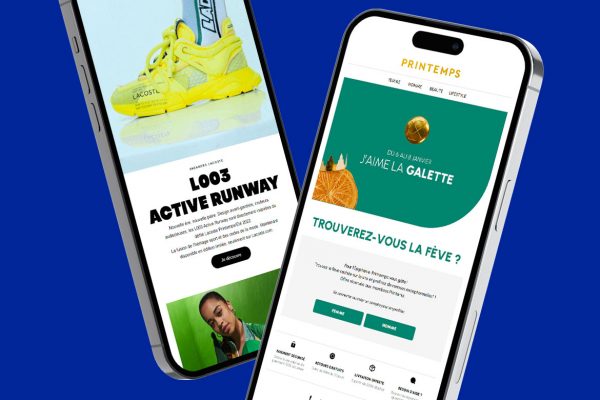
Need an example? The absolute champions in this field are undoubtedly Lacoste, who stylishly animated their campaign’s tagline – presented here in the header.


We also love:
🔥 The copywriting and how Lacoste reinvents the classic “Back To School” into their brand universe: “Back to Style.”
🔥 The minimalist approach to design: 2 dominant colors, minimal text, compositional rigor.
🔥 Elevating the Lacoste brand image and universe: elegance and sophistication even in the choice of uppercase “X” typography.
🔥 Perfect product presentation: rigorous composition with alternating full-width images and 4 columns + look photos and product photos, background color matching the collection.
🔥 A flawless marketing strategy with a final arrangement that promotes two other back-to-school offers in perfect alignment.
When it comes to emailing, Lacoste’s CRM team consistently excels, harnessing Dartagnan’s design functionalities (Design Landing Link) to create campaigns that truly reflect their brand: exceptionally stylish!
Lacoste Use Case: Discover how Dartagnan enabled Lacoste to translate their brand image into their email campaigns.
2. Have Fun with Back-to-School Newsletter Copywriting – The Printemps Model
The return to school often provides endless experimentation for expert copywriters in search of the right word or a striking tagline.
In this area, it’s hard to escape the classic “Back to School,” found from the subject line to the email footer and content.
We applaud Le Printemps (The famous fresh retailer for High fashion Brands) for creatively offering the variation “Quand vient la fin de l’été” (When the end of summer arrives), keeping in theme and rhyming: “Bye Bye l’été, bonjour la rentrée!” (Goodbye summer, hello back-to-school!)

We also love:
🔥 The effective sobriety of design through the overlay of 4 columns – allowing Printemps’ team to create an overview of the featured brands.
A note to retailers and pure players who sometimes struggle to present all their brands without overloading the composition: the column principle with a simple mention of the brand is clean, efficient, and works very well.
🔥 The use of GIFs within the 4 columns to animate the content, retain attention, and enrich collection views without overwhelming the composition.
🔥 Printemps’ creative invention that establishes the brand image right from the email header.
🔥 The opportunity seized by the CRM team to promote supplementary back-to-school offers.
Hats off to Printemps: once again, you’ve managed to stand out thanks to your email design.
3. Promote the right offers at the right time – The Made in Design Example
You don’t need to sell clothing or school supplies to ride the back-to-school wave. Made in Design, the pure player showcasing top design brands, proves it.
Made in Design chooses back-to-school to highlight its desks and related products. Clever move!

We also love:
🔥 The meticulously crafted copywriting that brings the story of the “Desk” object to light, adding an emotional touch.
🔥 The play of colors (very refined and elegant) and the alternation of backgrounds to create a dynamic composition.
🔥 The use of blocks to organize and destructure the layout.
🔥 The opportunity taken to promote related products and open a gateway to the rest of the catalog.
Well done, Made in Design! Your email is as stylish as your products.
4. Tell Your Back-to-School Offers as a Story – The Orchestra Case Study
FOMO (Fear Of Missing Out), storytelling, teasers, testimonials, acting – all techniques to make your email campaigns stand out from your competitors’.
So let’s savor this amusing campaign orchestrated by Orchestra and sent on:
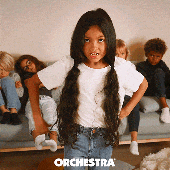
And as a bonus, the little GIF.

We also love:
🔥 This incredible GIF that gives voice to the little rascals! It’s irresistible and now’s the perfect time to let them speak.
🔥 The very amusing copywriting that plays with the childlike dimension.
🔥 The slight teaser effect that ignites curiosity.
5. Showcase Your Back-to-School Lookbooks – Pimkie’s Elegance
If there’s a trend to follow for presenting collections, it’s the Lookbook. And Pimkie’s Lookbook is exceptional!

We also love:
🔥 The lifestyle photos blending chic and urban styles.
🔥 Alternating full-width images and two-column layouts to vary perspectives.
🔥 The deliberate minimalism in copywriting that leaves ample space for CTAs: simple and effective.
Pimkie, your back-to-school looks and email are incredibly stylish!
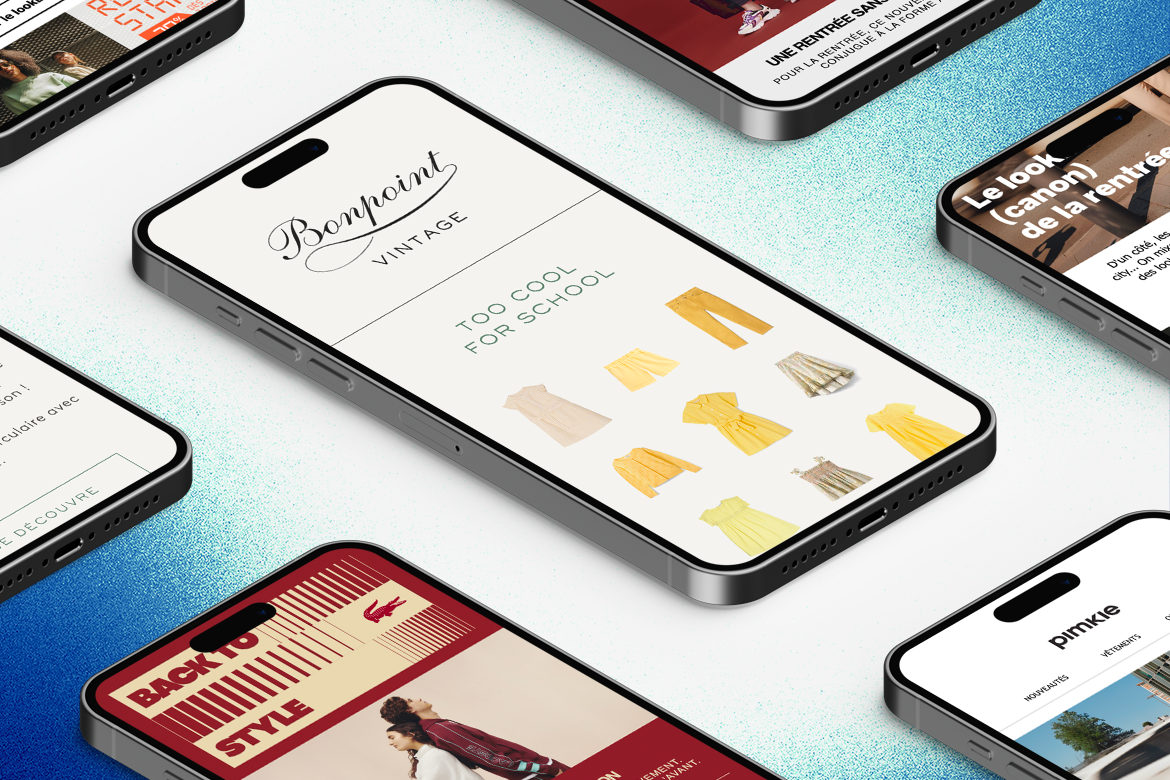
Dare Minimalist Back-to-School Newsletters – Enter Bonpoint
Striking the right balance in campaign design isn’t always easy. When in doubt, minimalist design is a better choice than an overloaded email.
Perfectly organized content, minimal text, a limited number of proposals and modules: Bonpoint manages to focus attention on a primary value proposition.

We also love:
🔥 The Baseline’s copywriting: very cool!
🔥 The elegantly staged clothing cutouts.
🔥 The use of wireframe separators, light and in harmony with this minimalist design.
🔥 The choice to highlight their second-hand line through a dedicated email.
This Bonpoint back-to-school newsletter truly lives up to its reputation!
And there you have it, this back-to-school selection! Whether you’re one of our clients or not, feel free to reach out to us: we have a ton of inspiration in store! See you in a few weeks for Black Friday inspiration!


Aucun commentaire pour l'instant