
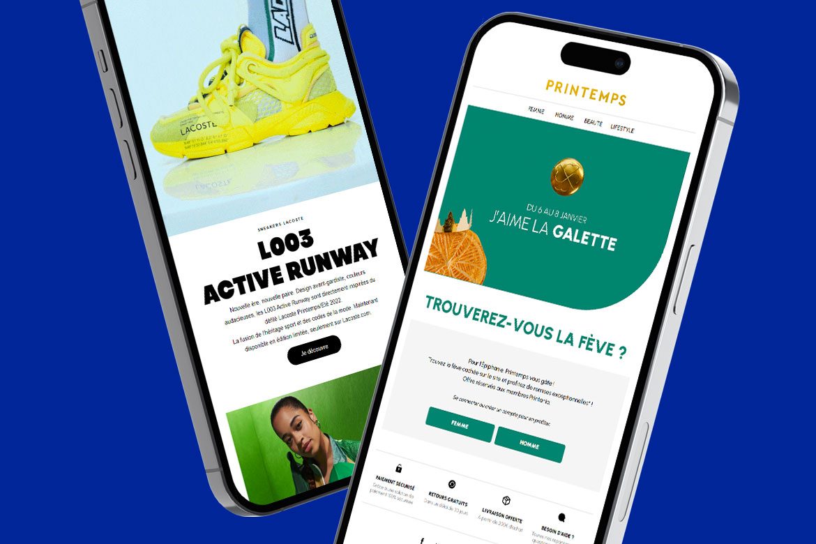
43%: that’s the percentage of emails opened on mobile devices in 2022. If you’re a marketing specialist and want to maximize your impact, you can’t ignore this figure. So, how can you take advantage of this email trend?
By considering mobile constraints more during the email design phase, or even adopting a Mobile First approach.
What’s the difference? Designing your campaigns based on a desktop template doesn’t prevent you from adapting it for mobile. Adopting a Mobile First approach means designing your emails with a focus on mobile users in all the design choices you make.
Desktop First or Mobile First? What matters most is ensuring that your email displays optimally on all screen configurations. Considering mobile constraints should be part of your continuous production process.
What are the rules to follow? What advantages can you gain from such an approach? How do you reconcile Desktop and Mobile approaches while preserving the user experience regardless of the reading environment?
Dartagnan explains which choices to make to adapt the client experience to the mobile approach and engage your audience on their smartphones.
43% : c’est le pourcentage d’emails ouverts sur des appareils mobiles en 2022. Si vous êtes un spécialiste du marketing et que vous souhaitez maximiser votre impact, vous ne pouvez pas ignorer ce chiffre. Alors, comment tirer parti de cette tendance emailing ?
| Looking for further inspiration for your email campaigns? Discover Dartagnan’s solutions for your creative and CRM teams. |
The Mobile approach for your email design: key principles to follow
Data, minimalism, and testing: designing your mobile marketing email campaigns is first and foremost about respecting these three basic principles.

Analyze your database to make informed choices
The first thing to do before adopting a Mobile-First approach is to analyze your database thoroughly, to have a good understanding of it, in order to assess the value of such an approach.
Identify, for example, the target audience of your campaigns, their behavior, and especially their reading devices.
For instance, if your target audience is primarily professionals, there is a high chance they open and read emails at work on desktop devices.
Font choices, insertion of dynamic and interactive elements, complex structure: mastering your database will help you make design or functional choices.
| Need advice on designing Mobile First campaigns and boosting your email strategy results? Contact our experts. |
Respect principles of minimalism and agility
In a mobile experience, the dominant principles are readability and fluid navigation.
Although mobile screens are rapidly evolving, they remain limited spaces, particularly sensitive to thumb and/or index finger clicks.
To ensure an optimal user experience, you need to make choices that lead to more minimalism and facilitate navigation within your email. In Mobile Email Design, less can be more
Texts, visuals, links, and CTAs… The more you lighten your content and provide spacing, the more you guarantee:
- Readability of your newsletters and emails
- Ease of navigation and consultation
These are two fundamental elements for the performance of your mobile campaigns.
Continuously test during email design
Perhaps the most crucial aspect of the mobile approach is compatibility. Regardless of the design and appearance of your emails, if they don’t display correctly, they will have no impact and won’t convert.
Designing responsive campaigns and testing their display on various reading configurations is crucial.
We recommend continuous testing.
Test your emails on different devices, screen resolutions, and email clients to identify readability or functionality issues.
Check the design’s responsiveness at each breakpoint. Adjust your template based on your tests.
This will prevent you from having to rethink everything once your campaign is completed.
Mobile First Email Design: What advantages does this approach offer?
Regardless of the approach you choose and your audience targeting, thinking mobile for your emails always benefits the user experience. Here are the advantages of adopting a Mobile First approach in your email design:
Boost your performance
Adopting a Mobile-First approach in your email design has a significant impact on the overall performance of your campaigns.
It’s now well-established that nearly half of emails are opened and read on mobile devices, and this number continues to increase each year. But that’s not all.
- According to a SaleCycle study, nearly 43% of consumers outright delete emails that are not mobile-optimized
- Email campaigns with responsive design have a 24% higher click-through rate and a 55% higher open rate.
In short, when thinking about the ‘performance of your campaigns,’ it’s essential to consider mobile and responsive design.
Reflect on the content and objectives of your campaigns
The Mobile First approach requires you to sort and prioritize the information and value propositions to keep only what is most important.
The advantage of this approach is that it is equally useful in a desktop approach: the more you focus on the value proposition, the higher the chances of conversion.
Check your content on a mobile template and streamline if necessary. This will allow you to reflect on the objective of your campaign and the most important elements.
You will find that, in the majority of cases, the version designed for mobile is often the most desirable, regardless of the reading device.
Improve the user experience
Because it offers a multitude of display configurations, Mobile is both the richest device in terms of design and one of the most demanding to manage. Furthermore, in terms of screen space, it is also the most limiting. However, he who can do more can do less.
Enhanced readability, faster image loading times, better management of margins and spacing, highlighting CTAs and value propositions: optimizing your design for mobile can only benefit the overall user experience, regardless of the reading device.
If your campaign is optimized for mobile, the navigation will be even more efficient on larger and more comfortable display devices.
Designing emails with a Mobile First approach is simply about increasing interactions within the email, click-through rates, and therefore conversions!
| Design, compatibility, support: discover why and how Dartagnan makes a difference in the conception of 100% responsive campaigns. |
Dartagnan: The Email Builder that guides you through the construction of responsive campaigns and the design of a Mobile First Email Design
L’Email Builder Dartagnan a été pensé pour faciliter aux équipes Marketing et CRM la conception de campagnes responsive et vous permettre de gérer les contraintes d’affichage mobile en toute autonomie.
The Dartagnan Email Builder has been designed to make it easier for Marketing and CRM teams to create responsive campaigns and enable you to independently manage mobile display constraints.
Une An optimized interface for Mobile Email Design optimisée pour un Email Design Mobile
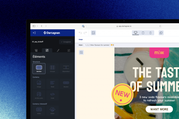
The Dartagnan designer allows you to manage different breakpoints independently. What does that mean in practice?
In the Dartagnan solution interface, you have access to three types of views: desktop, tablet, and mobile. Each of these views is independent from one another.
In other words, you can make changes to the mobile or tablet views to adapt and customize them as desired.
You can:
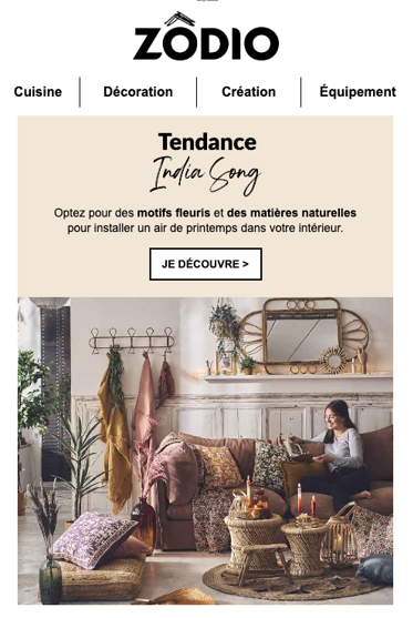
- Switch from a complex structure to a 1-column template, which is often more suitable for mobile
- Vary the visuals and their size based on the device to adapt to screen size
- Hide elements (text or visuals) for a cleaner Mobile Design
- Change from a regular link to a CTA and vary the colors to optimize readability and navigation on mobile
- Adjust font sizes
- Adapt space sizes: white spaces and margins
- Adjust image units from pixels (px) to percentages (%) to allow image adaptation to the device

The Background Feature: The Must-Have made in Dartagnan
When using an adaptive approach, visuals, especially header visuals with embedded text, often become problematic.
In desktop view, Marketing and CRM teams often choose a landscape banner with a value proposition integrated into the visual. The problem arises when adapting to mobile view, as the image is proportionally scaled down. Visuals and value propositions often become illegible, resulting in a degraded user experience.
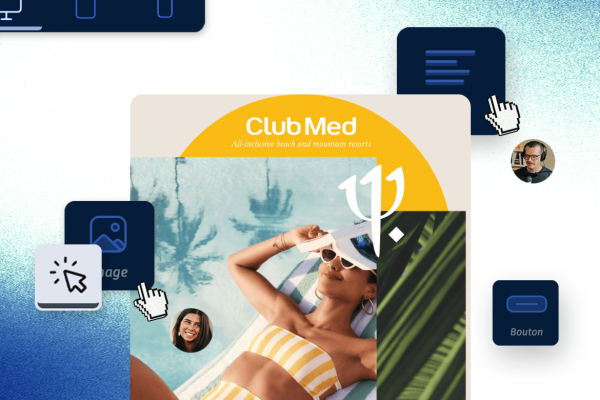
With Dartagnan, you have access to the Background feature. What is it exactly? It’s a background image to which you can add text elements (Message), images, and/or buttons (CTA).
The advantage? You have complete control over the mobile version. You can:
- Change the background visual to a more suitable one for mobile
- Work on the visual, including zooming or cropping
Additionally, you have control over adapting the text or image elements added on top, ensuring their integrity and readability on mobile.
Furthermore, you’ll save time since you have full control over the modifications, eliminating the need for back-and-forth with the creative team.
The background is somewhat of a must-have for the mobile experience, and it’s a specialty of Dartagnan.
The mirror link: an additional guarantee for Mobile UX
The mirror link is an integrated feature of Dartagnan that allows you to generate a test email at any stage of your campaign production process.
Its advantage: The Device Bar enables you to visualize and anticipate how your email will appear on different screen resolutions.


Aucun commentaire pour l'instant