
From the moment an email is opened, until the end of the scroll, how can you make a strong impression, from start to finish? By differentiating yourself with an animation charter, which aligns the email experience with the online experience. And amplifies your offers.
By carefully segmenting your database of recipients, you have increased your relevance. By working with punchy, intriguing and clever objects and pre-headers, you have further boosted your open rate. Congratulations! With close to 300 billion emails sent out… daily in 2019 (or an average of 80 daily messages per human being with an email address), you are already well-placed to capture the most precious asset for the modern marketer: attention.
So, congratulations, but… this doesn’t mean your job stops there. Because, once an email is opened, what happens next? Are your messages engaging? They need to make your readers want to linger and spend more than 11.1 seconds… or even eagerly await and feverishly open your next dispatches. In short, they need to offer an above-average user experience:
- surprising, attracting and engaging your readers from the moment they open your emails
- maintaining their attention as they scroll all the way to the bottom
- finally, emphasizing your campaign’s most salient messages and content.
GIFs, videos and cinemagraphs: animated formats are an excellent way to captivate and engage your recipients. But what if, instead of isolated promotional elements, animation was used throughout the email? Throughout all of your campaigns, even? This is the whole point of an animation charter for email.
What is an animation charter?
To put it in simple terms, it is the “moving part” of a graphic charter (to which we have devoted an entire white paper, to help your marketing and CRM teams to “frame” and accelerate the design of their campaigns).
A graphic charter defines your fonts, colors, style and treatment of images, icons, blank spaces, etc. With an animation charter, you can supplement this codification of the static elements of your campaigns with the right usage rules:
- hover effects for CTAs
- fade-ins, fade-outs and scaling
- parallaxes and other background animation
- etc.
Because a picture is worth a thousand words, this video shows some examples of effects that, if not classic, we are at least accustomed to finding on the web. And for the most curious-minded – and connoisseurs – at the end of this article, Alfredo from our UX/Design team will share a brief selection of web animations that we hope you will find inspiring.
So, what can you do in an email?
Not only is animation possible in email, but it is clearly an emerging trend in this, our favorite marketing channel. Google’s recent announcement of its AMP for Email framework is a strong sign of this: going forward, email marketing will be increasingly interactive, contextualized and animated.
Email marketing will become increasingly interactive, contextualized and animated
Inject theatricality from the start
In terms of animation, you can dramatize the arrival of your campaign, with a gorgeous “intro effect.” This will typically be your logo, your header and the “hero” image of your main offer… In short, everything that will appear above the fold will be strung together harmoniously, with a non-negligible surprise effect, because the first few seconds are always crucial. As a bonus, it will retain the recipient’s attention, in case it takes a little while for the email to load.

Amplify your offers
You will then be able to set the scene for your products to be displayed, with subtle zooming features, but also the fade-in appearance of elements from your campaign, as the reader scrolls down.

Focus attention on your CTAs
Finally, you will be able to increase the impact of these strategic CTAs, with these three hover effects, among others: brighten, darken and zoom. You should also note that hovering over a product image can also be very enticing, for example, by displaying a clothing item on an otherwise “empty” mannequin when the reader moves the mouse over it.
An animation charter does not “only” satisfy the need to improve a campaign’s user experience; it can also have a very concrete impact on your campaigns’ responsiveness and conversion rate.
Animations, visuels, polices...
Votre guide du design d'emails
Téléchargez notre livre blanc consacré à la charte graphique dans l'email. Méthodologies, règles de conception, inspirations... Tout pour "cadrer" le design de vos futures campagnes !
When do you need an animation charter?
On paper, any email marketing program would benefit from concerning itself with content animation rules. But there are some categories of advertisers for whom the question is even more vital:
- the luxury goods sector, as a whole: couture, leather goods, jewelry and watches, spirits, automobiles, etc., in short, any product with an extra bit of “flair”
- travel and, more generally, products that “sell dreams” (culture, food, beauty, etc.)
- retailers involved in home decor, apparel (outdoor, sportswear, fashion, etc.), high-tech products, etc.
Brand consistency, from TV to email
If your creatives have already developed animation guidelines for your other communication channels (your website or mobile app, your video channel and your TV commercials, etc.), adapting those guidelines to your email marketing will only further enhance your brand consistency. And, in the case of a specific website, ensuring a consistent experience can only have a positive effect on your conversion rate…
Another criterion for deciding whether or not to develop an animation charter is the composition of your subscriber base. If your emails are mostly read in contexts where interactive, animated emails are well-supported (iOS and Apple environments, in general, Orange and SFR webmail, Android, etc.), then this is a green light. If your recipients tend to check their email in contexts with more limited creative possibilities, like Outlook, then that’s a whole different story…
Why should you worry about this now?
Getting started on an animation charter means getting a step ahead of the competition, as well as scoring precious points in any advertiser’s struggle to offer the smoothest, most engaging customer experience on the market.
Because we are already starting to see a handful of email marketers laying the foundations for animation in email. They often do this discreetly, adding a touch here or there, but there can be little doubt that they will soon take it further… Here are some examples.
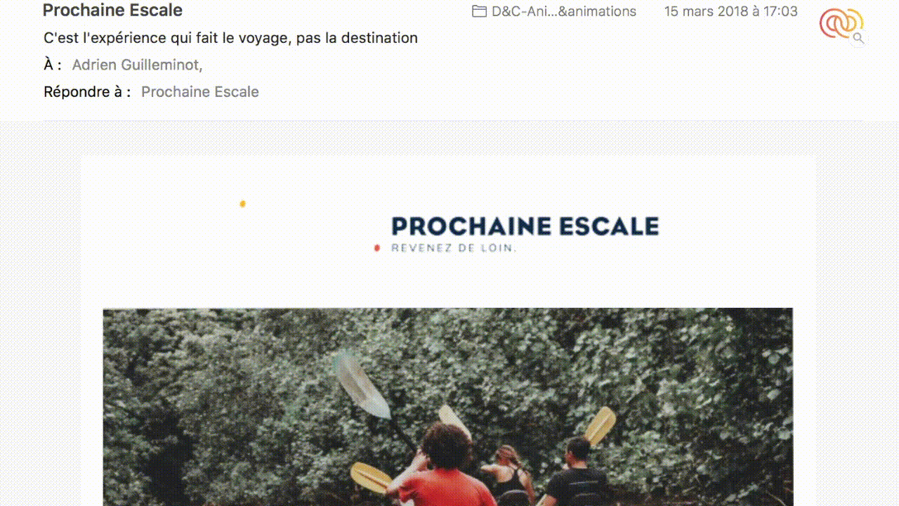
Prochaine Escale: Catching attention in a second
It’s subtle, but it does have an effect: simply by animating its logo in this email, the tour operator Prochaine Escale effectively gives pause and attracts the attention of the recipient. A “hook” created using minimal resources!
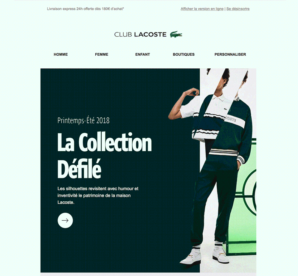
Lacoste: “Charting” its animated hero
Here, we see the same chic minimalism with the famous crocodile brand. The diagonal wipe transition for the hero image in its campaigns creates an immediately identifiable visual device. In addition, it is perfectly in line with the animation that the brand utilizes on its website.
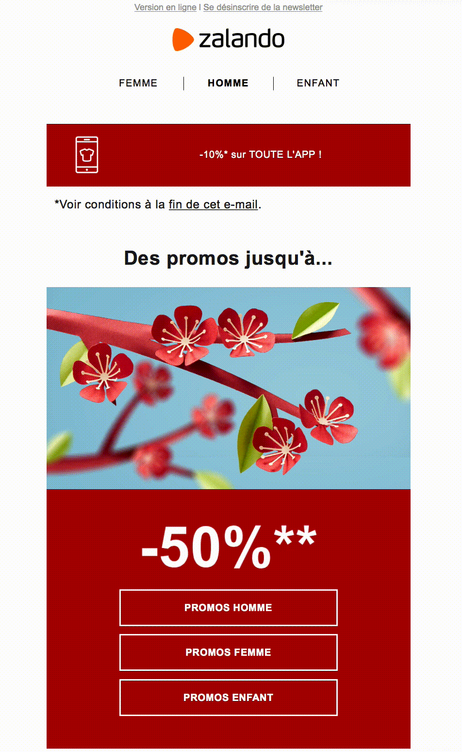
Zalando: Emphasizing the salient points
An email = a key message. In this campaign, the e-merchant Zalando fully adheres to that logic. The animation of the discount amount, combined with a very simple design, perfectly fulfills its duty of guiding the eyes toward the primary information.
Club Med: An advanced animation experience
In its teaser campaign, presenting the main new developments for 2018, Club Med made more advanced use of the possibilities afforded by animation in email:
- the whole message fades in
- animation in the header
- micro-animations for the four new resorts, tours and amenities that would be the highlights of the year.
The result? An extremely high-quality email, with multiple layers of text concealing multiple surprises. So, it offers some reading and possibilities for new discoveries, while retaining the core strength of email marketing: its ability to present special offers succinctly… while making the recipient want to learn more. Could this be an example to follow for your next campaigns?

Where can you find inspiration for your new animation charter?
Alfredo, one of our “research brains” on Dartagnan’s UX/Design team, has compiled a few examples of websites that manage to make smart use of animation effects, without them ever becoming gimmicky. Read on for a brief selection.
Hover effects in CTAs, parallaxes, fade-ins and imaging scaling by scrolling
Cinemagraphs, animated backgrounds and parallaxes
One-page scroll, fade-in and slide-down fonts, sliders, etc.
Mouse-based interactions and background-generating design

Livre blanc
Les clés d'une charte email réussie
48 pages de conseils et d'idées pour mieux exprimer l'identité de votre marque dans vos campagnes email, concevoir des communications à fort impact... tout en gagnant du temps.


Aucun commentaire pour l'instant