A more coherent design, tailored for email, and much quicker to implement in your campaigns: could Atomic Design be the best approach to standardizing your email communications?
A more coherent design, tailored for email, and much quicker to implement in your campaigns: could Atomic Design be the best approach to standardizing your email communications?
The statistic may be a bit daunting, but it will resonate with those involved in creating email marketing campaigns: 53% of brands take at least two weeks to “produce” a newsletter. The most time-consuming phases of this lengthy process? Design, followed by email revisions and approvals. Ouch! Or maybe that’s a good thing? Because you can save a lot of time on design and approval, especially by formalizing a true design system for email. And to ensure this design system is more than just a nice reference document, a design methodology will help you move from theory to practice: Atomic Design.
What is Atomic Design?
tomic Design is a design methodology (or philosophy) theorized by American designer Brad Frost in his 2016 book of the same name.
In short? Atomic Design involves reversing the traditional design logic. Instead of starting with the finished “product” (a poster, a web page, an email), it involves:
- First codifying the basic elements of the design (a button, a title, a visual treatment),
- Then assembling and arranging them to “produce” the final design.
So, it’s about “atomizing” the creation.
Atoms, Molecules… The Elements of Atomic Design
Practically, in Atomic Design, we distinguish five types of design elements, from the most basic to the most complex: the atom, the molecule, the organism, the template, and the page.
|
Atom |
Molecule |
Organism |
Template |
Page |
|
|---|---|---|---|---|---|
| Description | Basic design rules and components | Simple interface blocks made of a few atoms | A “zone” of the final interface | A design where all elements are in place but without content | The final result |
| Example | Your brand’s colors, visual usage guidelines, fonts… | A basic content block: button and input field, text + photo + link… | The menu or footer of a web page, a sidebar… | A wireframe or mockup of a page | A web page, a catalog page, a poster… |
The metaphor behind “Atomic Design” becomes clear: just like in chemistry, atoms are the foundation of all matter. But individually, a carbon atom (or your brand’s primary Pantone color) is not very useful: it’s the combination of atoms into molecules, and then molecules into organisms, that yields an interesting result…
Atomic Design, modular design: a response to design challenges in a multi-screen world
In the foreword of Atomic Design, two colleagues of Brad Frost explain that the idea came to him in 2013 while they were working together on the new version of the leading tech news site, TechCrunch. It wasn’t born out of nowhere: modular design and early thoughts on responsive email (in the early 2010s) had paved the way.
Get your content ready to go anywhere: It’s going to be displayed everywhere anyway.
The starting point is simple: designing fixed and finished “pages” no longer makes sense at a time when your content will be consumed on a computer or phone screen that varies in size, on a smartwatch, or even on a connected TV… As Brad Frost puts it, “Get your content ready to go anywhere, because it’s going to go everywhere.”
Thinking about content layout in the form of modules, which will be consistent with your design system but arranged differently depending on the display screen, is therefore the best response to this challenge.
The advantages of Atomic Design: agility, consistency, collaboration
UX designers quickly embraced the Atomic Design methodology… And for good reason, it offers three decisive advantages in interface design:
- Consistency Guarantee: After an Atomic Design process, you end up with a style guide, or even a complete design system, with the assurance of closely adhering to brand identity.
- Time Savings in Design: Since you create one version that will adapt everywhere instead of different versions for different screens. It’s also easier to test a nearly finished design in a real environment and fine-tune it afterward.
- Better Collaboration: Especially with technical teams. An atom or molecule are components that developers and integrators can code on their own: you speak the same language and use the same working methods.
A methodology that allows you to produce communications quickly, regularly, and consistently with brand identity, and to streamline collaboration between designers and developers—do you see an area where it would apply perfectly? Yes, us too…
Why is Atomic Design perfectly suited for email design?
Atomic Design was primarily developed with the constraints and methodologies of web design, or app design, in mind. Relatively complex design environments… but ultimately less so than email.
Atomic design better manages the 15,000 possible reading configurations of email
Where a web designer only needs to worry about a few constraints like the browser used (Chrome, Firefox, Safari…), and an app designer about the platform (iOS or Android), the email designer faces a potential combination of… 15,000 different reading contexts depending on:
- The device used (tablet, desktop, and a wide range of mobile phones)
- The email client or webmail (Gmail, Apple Mail, Outlook…)
- The operating system (Outlook for Mac, Gmail in the native app…)
The challenge of having a design that behaves correctly everywhere is therefore even greater when it comes to email!
Atomic Design best expresses your brand’s values
Most companies of a certain size have a style guide or another document that governs the brand’s communications. But it’s often designed for print (flyers, catalogs, brochures) or web (web pages, social media posts). Much less frequently for email, even though it is by far the most profitable communication channel. And especially the preferred mode of interaction by customers. The problem: the rules applicable to web design or print layout don’t always work for email. The use of special fonts, image sizes, content layout… are more “constrained.” With an Atomic Design approach, you can start from the fundamental elements of your visual identity and set rules that are truly adapted to email
Atomic Design saves precious time in the design of your campaigns
Email marketing design could be an Olympic discipline… although it may seem a bit too extreme for the Games! The task of CRM and marketing teams responsible for this channel involves:
- Endurance, with average design times for a campaign exceeding two weeks in half of all cases
- The pentathlon, since more than half of email teams work on more than five campaigns simultaneously (and some are even in the “decathlon” category)
- Hurdles, as each campaign is a succession of steps to overcome, with two being particularly time-consuming: design, then approval of that design…
In short, mastering time (and saving it) is crucial for email professionals.
And that’s precisely one of the strengths of an Atomic Design approach and its corollary: a “real” design system tailored to your newsletters. With a complete library of brand-colored components at your disposal, designing an on-brand campaign becomes much faster. And during approval, you can immediately argue that you are staying consistent with brand identity. By the way, that’s exactly what led us at Dartagnan to design our email builder on a modular system derived from Atomic Design: once created in Dartagnan, your content blocks feed your internal “creative catalog,” and are reusable from one campaign to another, duplicable within the same newsletter, etc. It’s probably why companies that produce a large number of emails and capitalize on large subscriber bases favor our solution…
How to adapt Atomic Design methodology to your email marketing?
Convinced of the value of an Atomic Design approach to rethink your campaign design? Then let’s look at how to proceed step by step.
Step 1, the Big Bang: gather the “ingredients” of your brand identity
Whether it’s called a brand book, style guide… you probably have a document that defines your brand’s visual expression rules. And if not, there are at least print or digital campaigns, specifications for your website… so plenty of clues to lay the foundation for your future email design system.
What are you looking for?
- Your logo and its different combinations (if any)
- Your fonts, typographic rules (when to use bold, underlining, what proportions between a title, subtitle, subheading, and body text…)
- The colors used and in what context (backgrounds or not, solid or gradient, in text…)
- What types of visuals are used and how they are treated (with or without borders, with cutouts, overlays)
- And finally, an “overall spirit”: is the design more airy or compact? Free-spirited or sober? Etc.
Step 2, the Atom: translate these assets into “Email-Compatible” elements

Next, you’ll need to use these elements as “atoms” usable in email. This can be very quick (if your brand avoided graphic “quirks”)… or more tedious if:
- You use a special font: apart from a few very common fonts, and web fonts in a few configurations, these special fonts won’t “render” in an email, and you’ll have to find a substitute font that closely matches.
- You make abundant use of image overlays, cutouts, and special borders, or textured backgrounds… which may pose integration problems in some email reading configurations.
Step 3, Molecules: combine your atoms into small content blocks

We then move on to the Atomic Design process itself by assembling the elements you gathered into small basic graphic elements that will be recurrent in your campaigns. To do this well, don’t forget to collect all these molecules in a library accessible to your entire team, which will serve as a reference.
For example:
- Color + usage rules for backgrounds + font = a CTA
- Font in <h2> + divider = a section title in your newsletters
- Icons linking to your social networks or for your reassurance blocks (delivery, customer service, etc.)
Step 4, Organisms: build the major recurrent modules of your emails

Armed with these still very basic molecules, you can then start building more complex organisms:
- Your top menu and footer
- Product blocks like “photo / name / description / price”
- Promotional blocks “photo + icon / name / description / crossed-out price”
- The block “visual / title / text / CTA” encouraging users to install your app
You’re free to go further at this stage by combining several of these organisms into more complex assemblies: a “grid” of 2 x 2 or 2 x 3 products, for example—this is what Dartagnan’s email builder allows through its modules. The key at this stage is to design the elements you’ll regularly need.
Step 5, Templates: arrange yur modules into “Drafts”
Next, combine the organisms you’ve designed into a template usable in your future campaigns. Unlike the templates provided by standard email design solutions on the market, this one will be truly tailored to your needs. And consistent with the brand image you want to convey…
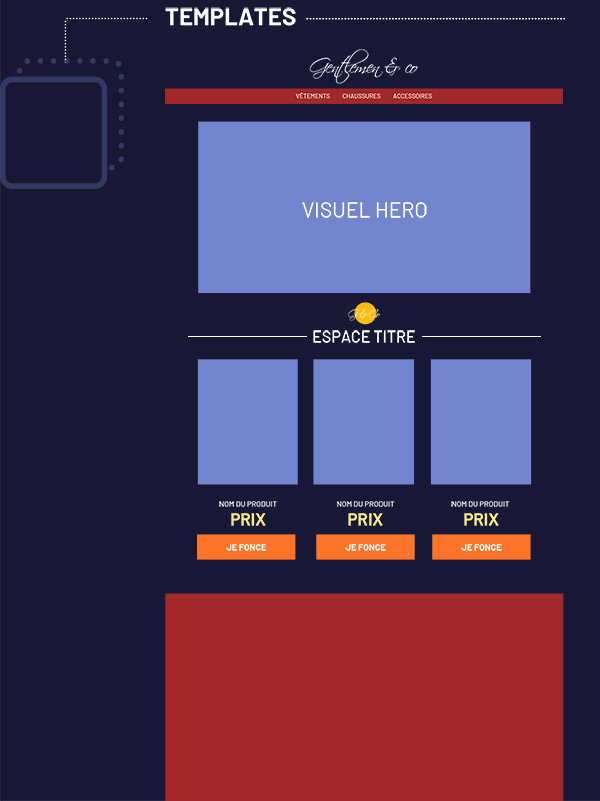
Step 6, Pages: design your campaigns with content
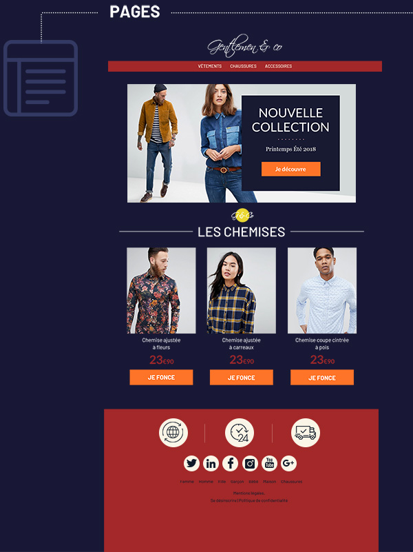
ou’re there: it’s now “just” a matter of injecting your content into the template designed using the Atomic Design methodology.
If your library of molecules and organisms is sufficiently stocked to cover all your needs, you’ll even have time to “tweak” your creation to give it a unique flavor, innovate, and test new approaches.
After all, a design system should always be a help and facilitator—but never a straitjacket!






Aucun commentaire pour l'instant