
When BMobile (the company that developed the Dartagnan Email Builder solution) released the first fully responsive email in 2013 for La Redoute, it was a significant technical advancement in the field of email marketing.
Christine Richard and Thomas Leroy (CEO and CTO of Dartagnan) then act as visionaries. They identify:
- A high customer demand for industrializing the production of their email campaigns
- A market trend characterized by the proliferation and complexity of email client environments
- An opportunity to seize – an accessible email builder that simplifies the creation of fully responsive emails
With this vision and ambition, Christine and Thomas carried forward the Dartagnan project, never compromising on their technical standards and quality. Nearly 8 years after its launch, Dartagnan has gained the trust of over 400 clients worldwide and still maintains a significant lead in terms of responsiveness and compatibility.
Its secret? A comprehensive approach that relies on the expertise of its employees and the support of its clients. The result? This unique capability in the market to guarantee and fulfill its promise of compatibility.
Let’s look back at the journey and approach of Dartagnan, an Email Builder that truly sets itself apart and continues to explore the possibilities in the world of email marketing.
| Want to discover the power of the Dartagnan Email Builder? Schedule a demo with our team members today! |
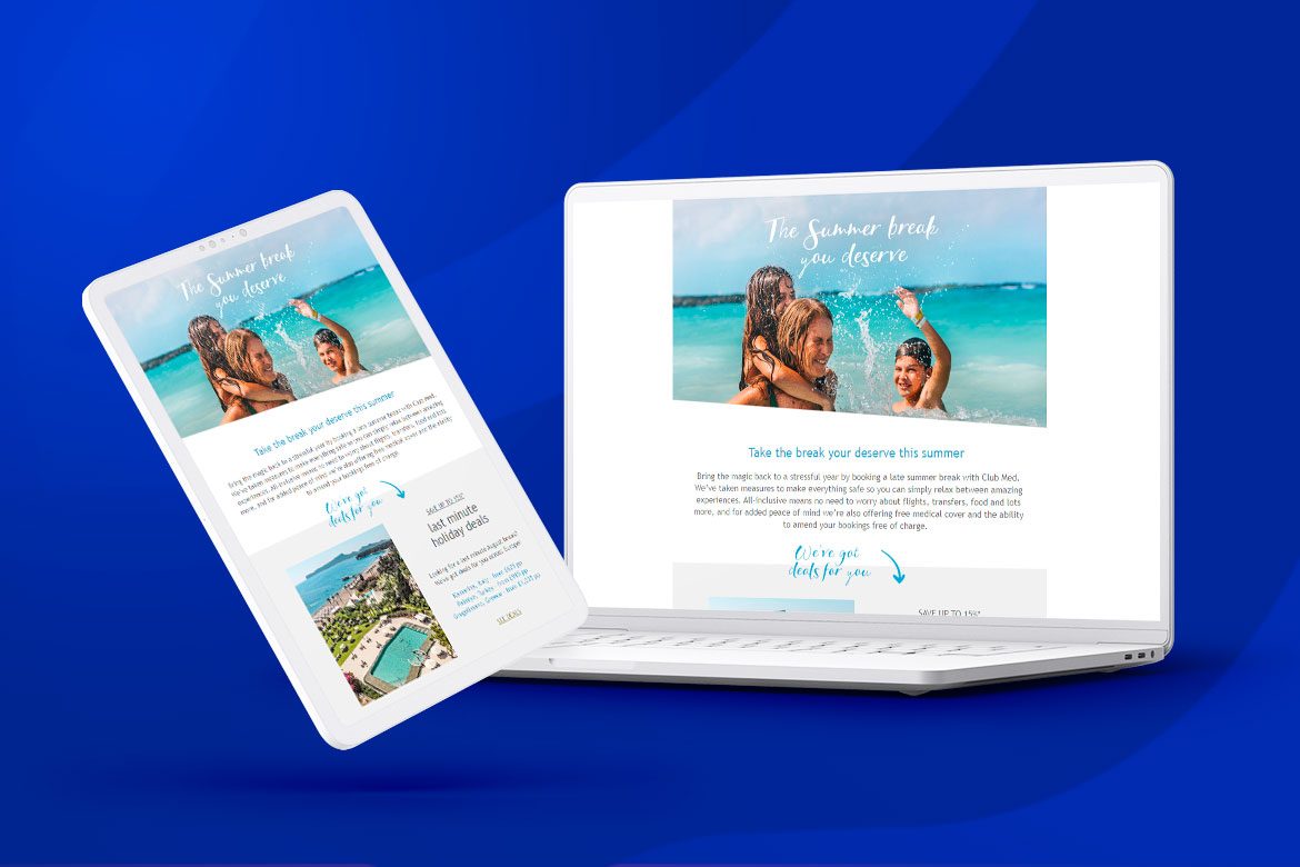
Dartagnan: a pioneer in responsive emails
No responsive email, no performance
With over half of the world’s routed marketing emails being opened and viewed on mobile devices, the equation is simple: if your emails are not responsive, your campaigns simply cannot convert.
But what exactly do we mean when we talk about responsive emails?
A responsive email is an email that has been thoughtfully coded and designed to be supported and displayed on any type of device: desktop, tablet, or mobile.
Today, designing a responsive email may seem like a given for everyone, but it hasn’t always been the case, and, more importantly, it’s often less straightforward to achieve than one might claim.
Dartagnan: a pioneer in the realm of responsive emails
Dartagnan’s story began in 2013 when BMobile developed the first fully responsive email for La Redoute. This was a technical advancement that had never been achieved in France before and a significant event in the field of email marketing.
This use case allowed Christine Richard (CEO of Dartagnan) and Thomas Leroy (CTO of Dartagnan) to realize that no tool on the market at that time allowed for the straightforward administration of email in an industrial context. The story continues…
As they worked on streamlining code, pondered modular structures, and developed integration methodologies to industrialize content updates between 2013 and 2015, BMobile conceived and refined an email design solution. This marked the birth of Dartagnan.
At that time, a few builders were already established in the market, primarily as embedded features within routing solutions, using a WYSIWYG (What you see is what you get) approach.
The outcome: integrated code and the ability to flexibly edit text and image areas. Despite some shared hesitations and the proclaimed failure by some, Dartagnan decided to push further ahead!
| Innovative design, collaborative mode, campaign industrialization… Discover all the features of Dartagnan. |
Dartagnan’s DNA: a full responsive and user-centric approach
In a way, the agency BMobile served as the perfect R&D tool. It allowed the Dartagnan teams to understand the challenges and constraints of clients and, most importantly, to realize the extent of an unaddressed yet already present need for Marketing and CRM teams: achieving the most optimal production timeline for their email campaigns.
From its inception, the Dartagnan solution was, therefore, designed and developed with a User-Centric approach.
To learn more about Dartagnan’s User-Centric approach, listen to Matthieu Karolewicz, Product Owner at Dartagnan.
| To learn more about Dartagnan’s User-Centric approach, listen to Matthieu Karolewicz, Product Owner at Dartagnan. |
At the time Dartagnan entered the scene, the dominant practice (still widely used today) was to adopt an adaptive approach. In other words, an email would be created for the desktop version and then scaled down to fit tablet and mobile views.
With Christine Richard’s UX Design approach as its foundation, Dartagnan took a different path by embracing a full responsive approach. The CEO’s primary goal was to design a solution that allowed clients to create any type of design without any technical constraints and ensure compatibility across all types of email clients.
The display constraints were already numerous, and the method was not yet fully developed. However, Dartagnan believed in this approach, persisted, and year after year, set a new standard in the market.
Since then, hardly anyone would think of designing their emails without a Mobile-First approach. Dartagnan, on the other hand, had a head start. Its unrivaled expertise has earned the trust of over 400 brands, including renowned names like L’Oréal, Dior, LVMH, Lacoste, and more.
Responsive email: how does Dartagnan make it easier for you to create truly compatible campaigns?
Designing a responsive email: easier said than done
Designing responsive campaigns is a hot topic, but few templating tools can truly implement it. Why? Simply because the compatibility of your emails across the various devices used in the market doesn’t solely depend on your templating tool.
In reality, the display and compatibility of your campaigns depend on:
- The receiving device and, therefore, the screen size
- The operating system/environment (iOS/Android) of the device
- The email client and even the displayed email address
Ultimately, the combination of all these factors can lead to up to 12,000 possible combinations. That’s as many chances of having your images, fonts, designs, etc., unsupported or altered.
Additionally, the actions of your routing solutions can further transform the code once digested, leading to new display issues.
Conclusion: In nearly 100% of cases, it’s these external factors rather than the coding of your campaigns that cause compatibility issues.
The promise of designing 100% responsive and compatible emails is, therefore, not as easy to fulfill on the design side as it may seem.
Dartagnan’s approach: a Comprehensive approach
Fully aware of these realities, Dartagnan has chosen to adopt a comprehensive approach, and it is this approach that allows them to make all the difference and fulfill their promise of compatibility.
The three pillars of their methodology are:
- The quality of their solution and regularly updated code.
- The cross-functional expertise of their team members, encompassing both tech-development and design.
- Daily customer support to help resolve issues almost instantly as they arise.


Dartagnan’s methodology for responsive emails
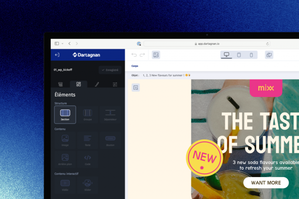
1. A single interface
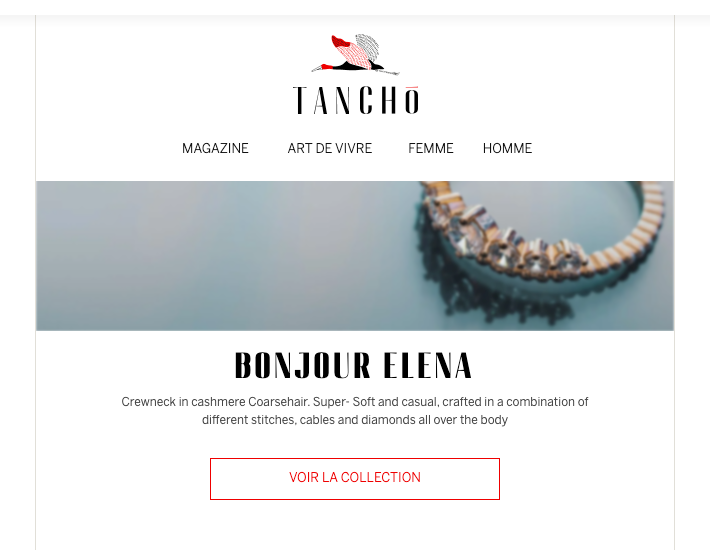
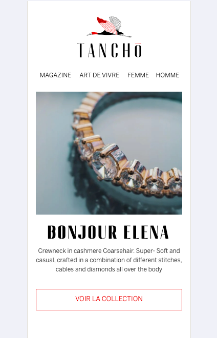
Dartagnan’s Email Builder designer has been designed to offer a customized display based on breakpoints, allowing users to have complete control over personalization and rendering, regardless of the viewing device: desktop, tablet, or mobile.
Translation: the majority of email builders only allow partial customization of the mobile view. You design your campaigns for a desktop view, and either the mobile view is entirely and automatically generated by the email builder (so you have no control over it), or you have limited options for customization.
In the Dartagnan solution interface, you have access to three types of views: desktop, tablet, and mobile. Each of these views is independent of the others. In other words, you can make adjustments and customize the mobile or tablet views as you wish.
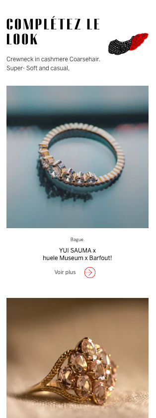
| How about taking a look at the stunning emails from our clients? Let’s focus on the luxury emails from VeryChic. |
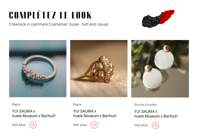
2. Unparalleled degree of customization
With the Dartagnan solution, you can intervene and customize nearly all elements of your campaign based on the device, far beyond the usual parameters like font size, color, or images.
This level of customization is hard to achieve unless you outsource the design of your emails, which entails:
- Higher design costs and longer lead times.
- Reduced agility in the design process.
- Loss of autonomy and productivity.
3. Proprietary solution
In a nearly unique situation in the market, Dartagnan does not rely on any third-party solutions and owns its code and email rendering engine.
Why is this important? Because it allows Dartagnan’s technical team to regularly update its code and solution (multiple times a week) in response to market changes and constraints.
In essence, we anticipate potential display issues on a day-to-day basis.
4. Continuous market monitoring
With each evolution of email clients, mail readers, and mobile environments, there is potentially a new set of incompatibilities.
Dartagnan’s strength lies in its R&D team, which continuously monitors these developments and directly intervenes in its source code to anticipate and resolve potential incompatibilities.
Through this process, Dartagnan continuously addresses 95% of display configurations.
For the remaining 5%, we invite you to refer to point 6.
5. A unique testing laboratory in the market
The device Lab: that’s the name of the testing laboratory developed by Dartagnan. With an annual investment of tens of thousands of euros, Dartagnan has built and regularly updates a stock of nearly a hundred devices, including all the latest and most commonly used mobile devices on the market.
Thanks to this lab, members of the PCM team can continuously test and verify client campaigns on all the most common display configurations.
As soon as an issue (or an update) is identified on one of these configurations, it is immediately reported to the R&D team to anticipate and resolve any display problems.
6. Support throughout the customer journey
Despite the entire methodology implemented by Dartagnan, it’s not always enough to solve 100% of the display issues encountered by our clients. CRM and Marketing teams are never immune to new problems they may not have the means to resolve.
That’s why Dartagnan is there for its clients throughout their journey.
- During the onboarding phase, we share our expertise to enable teams to adopt best practices.
- Our Support Team is available in person and around the clock to respond to and resolve client issues in real time.
Dartagnan truly goes the extra mile to ensure that emails produced with its solution are among the most compatible in the market.
But it’s mainly thanks to its R&D team that Dartagnan achieves real miracles. Noel Scozzesi, Email Integration Developer, says, “Today, thanks to our methodology, our clients can address 95% of display configurations autonomously. For the remaining 5%, while we can’t anticipate all the problems, we can absolutely solve all of them as long as they are reported by the client, and we have control over them.“


Aucun commentaire pour l'instant