After Christmas, Black Friday is the most anticipated shopping event for consumers, and it also generates the most revenue for many advertisers. In 2022, Black Friday marketing emails campaigns generated nearly $4.5 billion in revenue in the U.S. alone, with an average open rate of 26%.
If there’s one event you don’t want to miss to boost your year-end sales, it’s Black Friday. And Marketing and CRM teams know this well! Influencer marketing, flash sales, exclusive offers, unboxing, contests, referrals, in-store events: there’s no shortage of creative ideas to capitalize on the occasion.
But to ensure a successful Black Friday, brands are unanimous: your email strategy is your best ally for engaging customers and driving sales. To help you enhance the performance of your Black Friday email campaigns, here are the expert tips from the Dartagnan Email Builder team.
| Black Friday Marketing Emails: Download our portfolio for even more inspiring examples and practical tips. |
Tip #1: Create a dedicated style guide for your Black Friday marketing emails
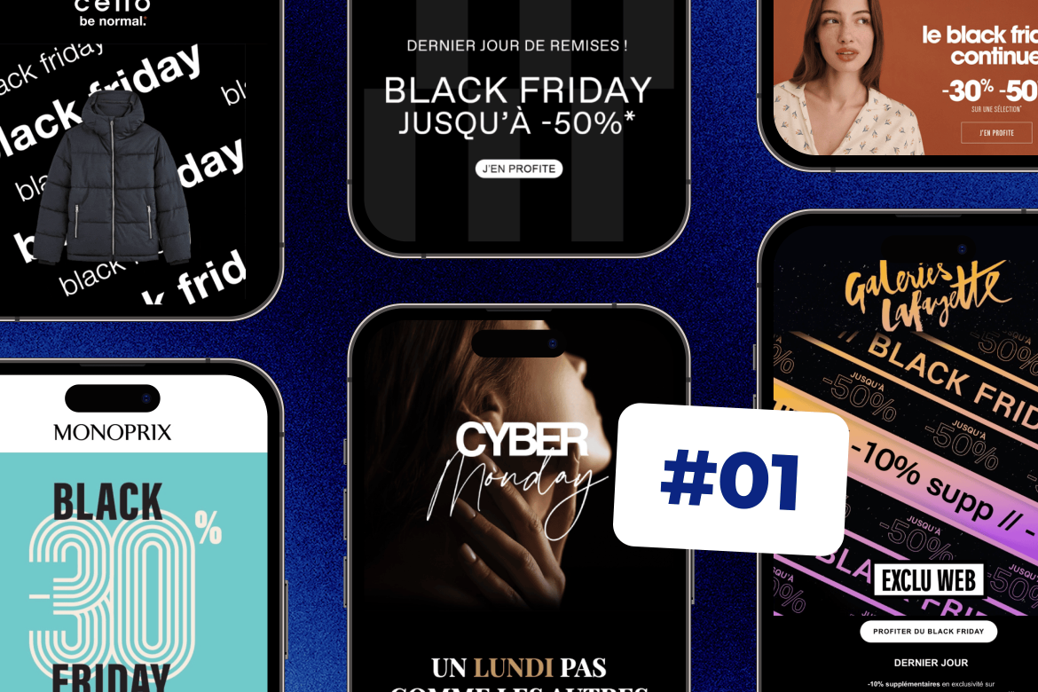
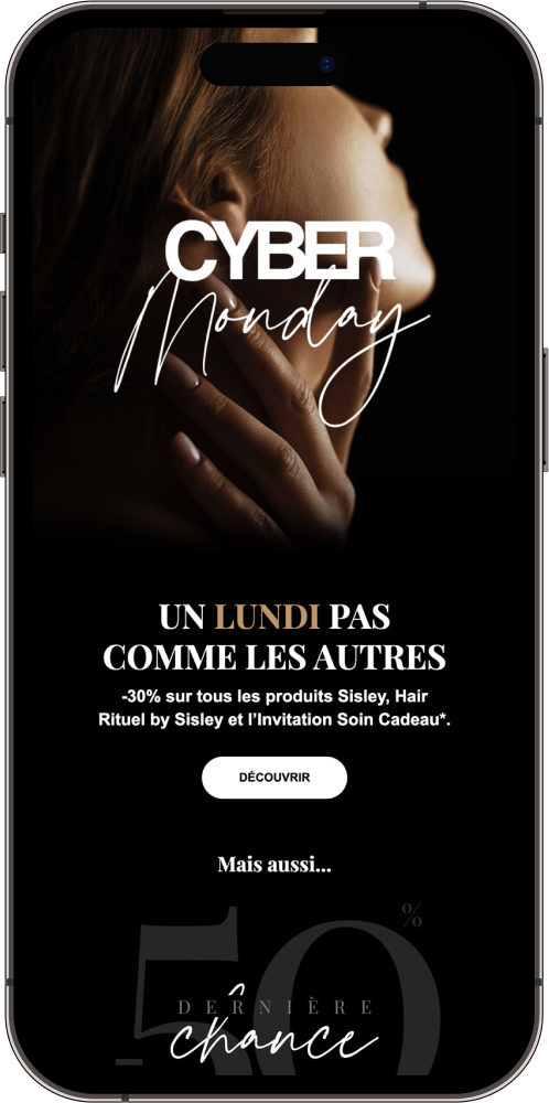
Black Friday is the perfect time to step out of your usual design patterns and make a lasting impression on your subscribers. Take advantage of this by creating an exclusive design using bold colors traditionally associated with the event. This not only helps you establish a strong and specific visual identity for Black Friday but also immediately signals to your subscribers that this is a special offer.
Choose eye-catching color palettes focused on black
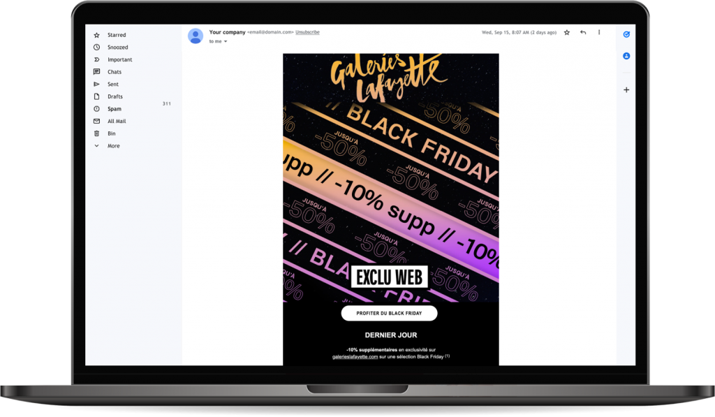
Black is inherently linked to Black Friday, evoking elegance, mystery, and luxury. For your emails, use dark tones like deep black, accented with touches of gold, silver, or white to create visual contrast that grabs attention. These palettes give your campaigns a premium feel, making your offers even more attractive and exclusive. By playing with subtle shades, you can emphasize visual depth and create a sophisticated effect that stands out from typical emails.
Dare to use full black emails with contrasts and nuances
A fully black email, when handled with the right contrasts, can create a striking visual impact. “Full black” grabs attention and offers an immersive experience that is even more captivating. Play with contrasts by incorporating white or colored elements to highlight your products or call-to-actions. This creates a strong visual dynamic that captures attention the moment the email is opened.
Tip #2: Play with hover effects on your CTA buttons
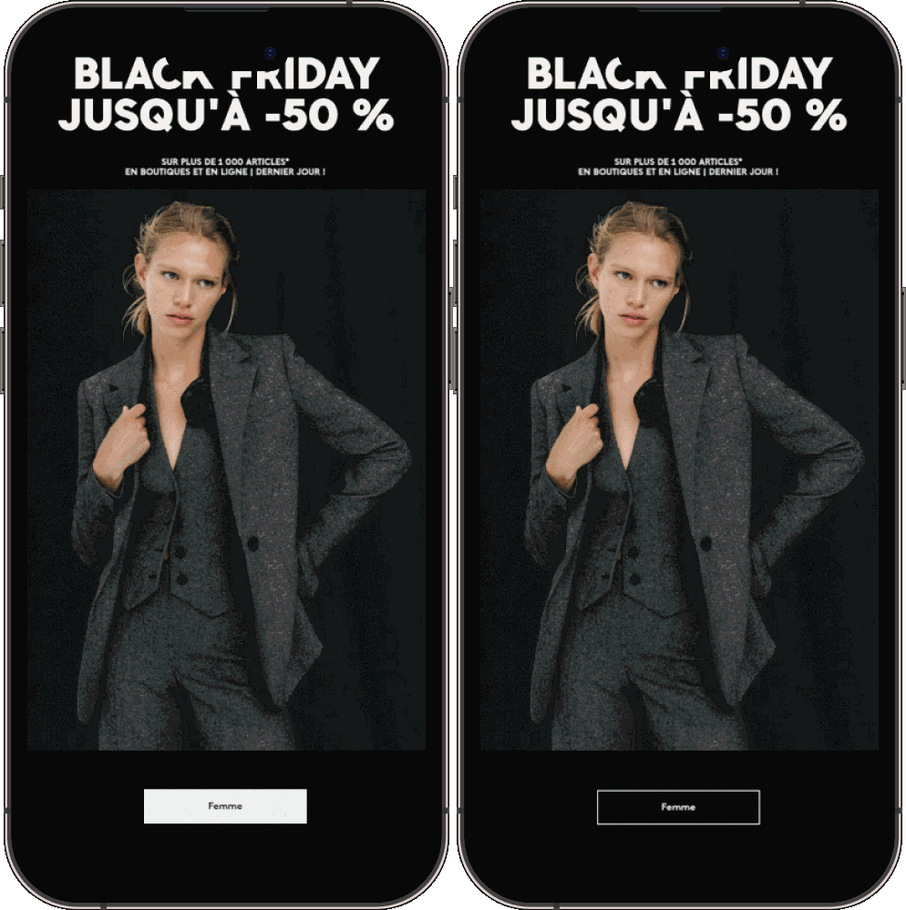
The CTA buttons in your emails are key conversion elements, and during Black Friday, they need to be particularly impactful. Use the “hover” effect (where the button appearance changes when the mouse hovers over it) to energize your emails and enhance user interaction. For example, a black CTA that changes to gold or a bright color on hover creates a pleasant visual surprise and encourages more clicks. This small interactive touch, while subtle, draws attention without overloading your email design. By incorporating the hover effect, you make your CTAs more engaging and intuitive.
| Hover state, video backgrounds, and more: discover all the Design features of the Dartagnan Email Builder. |
Tip #2: Create specific copywriting for your Black Friday marketing emails
Black Friday is the perfect opportunity to energize the tone of your emails and revisit your editorial style, just as you did with your graphic design. This special moment calls for impactful copywriting that immediately grabs your subscribers’ attention while creating a sense of urgency. Thoughtful, specific copywriting will help you stand out during Black Friday and maximize your audience’s engagement.
Polish your email subject lines
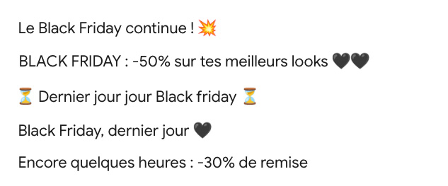
The subject line is the first impression you make, and it should reflect the intensity of Black Friday. Highlight your promotional offers right from the start with direct and catchy phrases: “Exclusive Black Friday Offer,” “Last Chance: Limited Discounts,” or “Don’t Miss Our Hot Deal.” Use strong action verbs, and where appropriate, include event-specific emojis to catch the eye in an overcrowded inbox. A well-crafted and personalized subject line can increase your open rates by 50%.
Customize the tone and content of your email
Adapt your messaging to emphasize the urgency and exclusivity of Black Friday by using language that conveys scarcity and immediacy. Terms like “limited-time offer,” “hurry,” “low stock,” or “only a few hours left” enhance the need for immediate action. Feel free to play with puns, use playful hooks, and make event-specific references. This makes your emails more memorable and engaging while staying aligned with the promotional spirit of Black Friday.
Tip #3: Create even more immersive and striking templates
During Black Friday, your subscribers are bombarded with emails, making differentiation essential. Your email needs to grab attention at first glance, even before the subscriber reads your message. The Black Friday look offers a unique chance to experiment with more immersive, bold, and memorable templates. Here are some tips to stand out and create eye-catching visual effects:
Use full-width visuals and animations
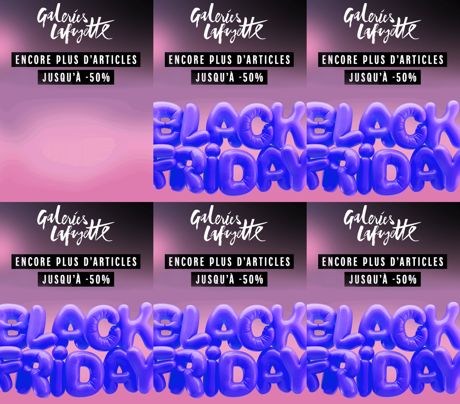
Opt for full-width images or background colors to instantly immerse the reader in the Black Friday atmosphere. You can also incorporate animated gifs or micro-animations to draw attention to your offers without overloading your design.
Customize CTAs with interactive effects
Your CTA buttons should be more than just a simple call to action. Opt for interactive effects, such as color changes or animations on hover, to add dynamism to your emails. Bright colors on a dark background (or vice versa) create striking contrast, highlighting the urgency of your Black Friday promotions.
Play with gradient effects between your visuals and background colors
With black, you can create beautiful continuity effects and give the impression of full immersion throughout the email.
Use bold fonts
Choose large, impactful fonts that reflect the importance of the event. Ensure they remain legible, even on mobile, and that they reinforce the urgency and exclusivity of your offers. Contrasting fonts with your black or white background will help create additional visual impact.

Tip #4: Optimize your emails for mobile display for Black Friday campaigns
With over 60% of purchases made on smartphones during Black Friday 2022, it’s essential that your emails are perfectly adapted to mobile display. A poor mobile experience could cause you to lose valuable sales, especially when the immediacy of promotions is crucial. Here are some key tips to ensure a smooth and effective mobile experience:

Choose a single-column template
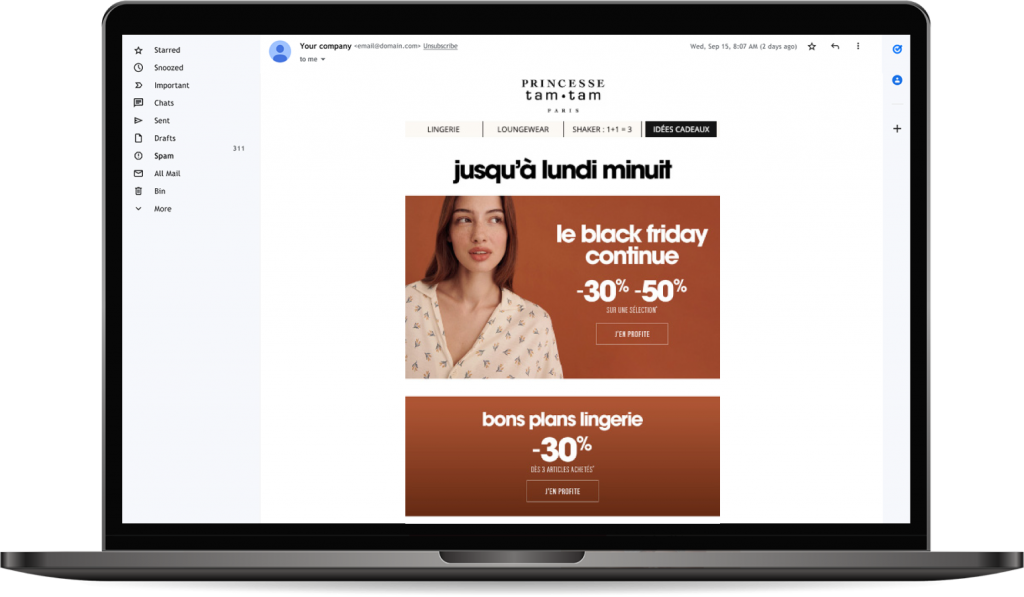
The single-column design is ideal for mobile, offering a simpler, more fluid display with stacked blocks that prevent confusion. This format improves readability on smaller screens and avoids distortion or overlapping of visual elements.
Use lightweight, optimized images
Loading speed is critical on mobile. Be sure to use compressed, lightweight images that download quickly, even with slower network connections. Heavy images could lead to high bounce rates, as your subscribers won’t wait long to see your offers.
Pay attention to the size and placement of CTAs
Call-to-actions (CTAs) must be large enough and well-spaced to be easily clickable on a touchscreen. A minimum size of 44×44 pixels is recommended to prevent click errors. Place your CTAs in strategic, highly visible locations and use contrasting colors to make them stand out immediately.
Test dynamic features
Some dynamic features, like animations or carousels, may not be supported on certain smartphones or email applications. If you use this type of content, ensure that you provide static fallback versions so that your email remains readable and functional across all devices.
Reduce content and simplify the message
On mobile, clarity and conciseness are essential. Avoid long emails that require endless scrolling. Focus on short, direct messages centered on the offer or desired action, so that the user quickly understands the value of your proposition. Each content section should have a clear and specific goal.
Use appropriate font sizes
Ensure the text in your emails is easily readable on mobile. The recommended minimum size is 14 pixels for standard text and 22 pixels for headings. This guarantees optimal readability without forcing your subscribers to zoom in to read the content.

