Each month, Dartagnan highlights a client email that will inspire you. We begin this series with Lacoste, which made a strong impact by promoting the mobile wallet experience in an email crafted by Dartagnan.
Retailers and marketing experts are talking about it more and more:
👊 It doubles the purchase frequency of its users.
👊 It fits right in your pocket.
👊 It generates, on average, an additional 20% in revenue for brands that use it.
Recognize it? Yes, we’re talking about the mobile wallet! In just two years, with the e-commerce boom, the wallet has skyrocketed. Today, it’s become one of the most coveted tools for marketing teams. So, it’s impossible to ignore—but how do you promote it? Lacoste delivers a more than convincing demonstration in this email, made by Dartagnan, to promote its wallet, brilliantly executed in partnership with Captain Wallet, the leader in Mobile Wallet in Europe!
👉 The Wallet Experience by Lacoste: we love it, and here’s why!
1. Proud of my wallet
Many brands still choose to promote their loyalty program in a discreet block at the very end of an email, right before the footer. Dematerialized loyalty or payment cards are a very practical service, but not exactly glamorous. Not something that gets the crowd excited!
But that was BEFORE. And certainly not with Lacoste, which fully understood the impact of the mobile wallet as a tool for customer acquisition and loyalty in its marketing strategy. Here, Lacoste takes a bold step by dedicating an entire email to promoting its services.

💥 The promise is announced in a concise but effective headline. Its sleek design and careful font choices highlight the added value of this highly personalized mobile experience: “Your Loyalty Card IN YOUR MOBILE.” In other words: “Download your loyalty card on mobile and add it to your wallet.”
💥 Devices are centered in the email, showcasing the loyalty card.
💥 The text is minimal, with no additional content: the message is clear.
💥 1 goal = 1 CTA (Call To Action)
It’s simple, it’s elegant, it’s beautiful, and it’s incredibly effective! It took some courage, but Lacoste did it!
2. The power of the Gifs
We mentioned it a while ago in one of our articles that remains just as relevant today. The GIF is an incredibly powerful tool for your marketing emails. Among other things, it helps to:
- Showcase your products creatively
- Illustrate your services dynamically to help customers better understand them
Mission accomplished by Lacoste!
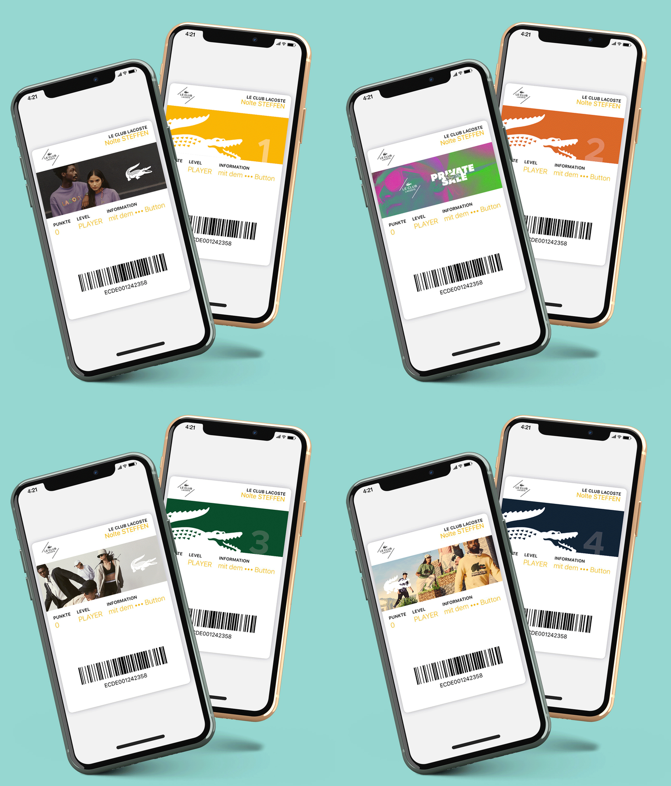
💥 The GIFs inserted into the mobiles at the center of the email draw our attention to the Le Club Lacoste card and its services.
💥 Their placement and structure are particularly well done, thanks to Dartagnan’s advanced features, which make integration smoother. On the customer side, they will be viewable across all devices, making them accessible to the entire Lacoste community.
💥 Private event announcements, points accumulation system, privilege levels, the ability to pay online: readers quickly grasp all the potential of the loyalty program and the wallet experience by Lacoste.
💥 The mockup is of very high quality, making it easy for customers to imagine themselves using it.
💥 The first device highlights the benefits at your fingertips: collections, exclusives, private sales… The other showcases the different privilege levels. Everything is in sync.
No need for explanations—we already get it 😉
ALSO READ: 4 Ways to Be More Creative with GIFs in Emails
3. United colors of Lacoste
Le Club Lacoste is a private, personalized, privilege-rich experience, and this email is its showcase.
💥 The large blue background allows for deeper immersion and facilitates message comprehension.
💥 The gradient creates contrast without disrupting readability.
💥 The progression of blues, from lightest to darkest, perfectly complements the email’s 4-part structure:
- 1 – The promise: download your card and enjoy all the benefits of the Le Club Lacoste in your mobile.
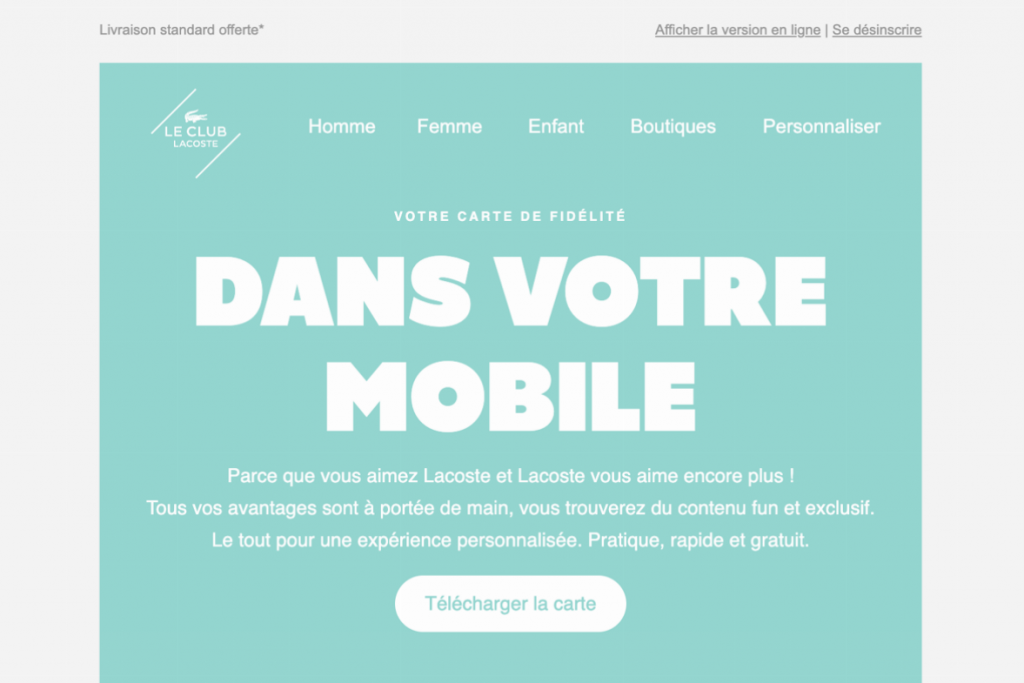
- 2 – The illustration: visualization of the Le Club Lacoste card.
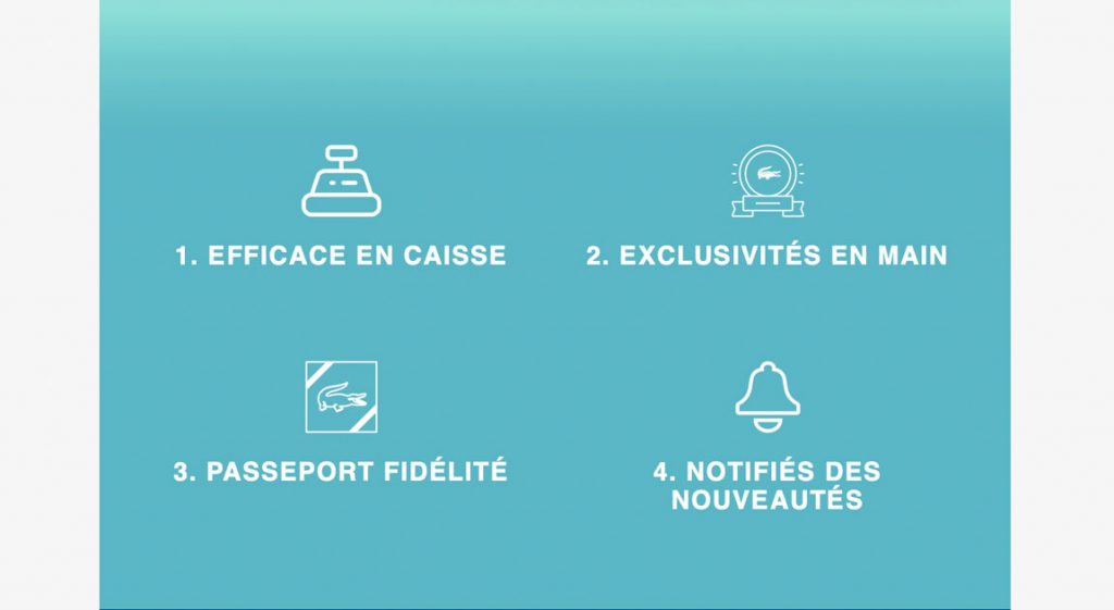
- 3 – The explanation: the benefits of the loyalty program summarized in 4 points.
- 4 – The action: saving the loyalty card in the wallet.
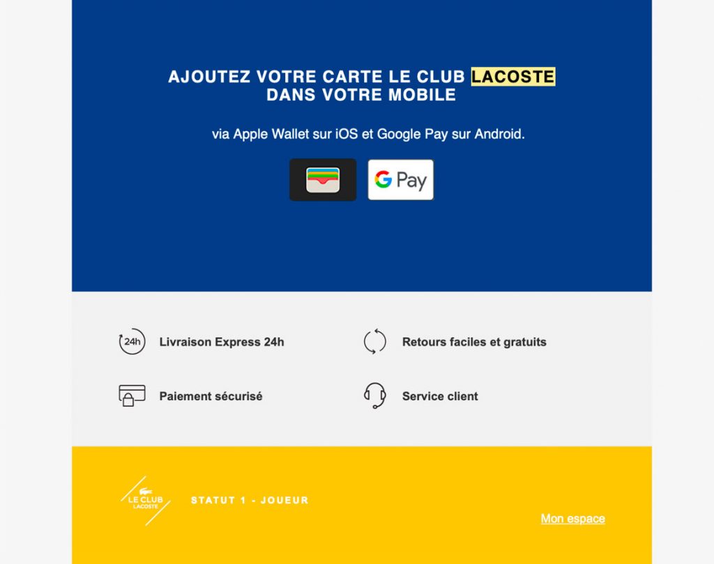
The logic is flawless, and the momentum is irresistible. Everything leads us to the wallet section.
💪 And that’s how Lacoste establishes its presence in your mobile!
4. Wallet is branding
The wallet is a formidable marketing weapon. Once downloaded, the loyalty card becomes a very powerful point of contact.
It allows Lacoste to offer its customers a highly personalized experience, engage in direct communication with them, and communicate its marketing actions via Push notifications.
This email, like the brand’s omnichannel strategy, subtly yet effectively engages its community in the Lacoste brand universe.
💥 The logo, fonts, and Lacoste colors have been adapted to enhance the branding of Le Club Lacoste and further personalize the experience.
💥 The design remains characterized by its simplicity and elegance: not everyone can be Lacoste!
Consistency and personalization: a true creative gem.
In short: this Dartagnan-made email is all about Lacoste’s class in your wallet and in your pocket! 👏👏👏👏 Well done, Lacoste!



Aucun commentaire pour l'instant