The sales period is crucial for e-commerce businesses and retailers. How can you design and craft sales emails that will engage your recipients? Here are our tips (and best practices from Nature & Découvertes, Sarenza, G-Star…).
With the rise of private sale platforms and numerous “privileged” sales, along with events like Black Friday or French Days, the sales period is slightly less essential than before. However, it remains a key moment of the year for retailers and e-commerce businesses.
If there’s one time of year when inboxes fill up rapidly, it’s during the winter (January-February) and summer (July-August) sales. These are the periods when standing out in inboxes, being relevant and engaging in your communications, and knowing how to follow up effectively are more critical than ever.
How can you do this? Here’s a step-by-step guide for relevant sales mailings.
1. Before the big day: leverage the FOMO effect
In the collective unconscious, sales are still associated with this: the doors of a large store opening early in the morning on the big day, hordes of customers rushing in to grab the items they’ve been eyeing for days, fighting over them… Exciting or stressful?
It doesn’t matter: the sense of urgency and the fear of missing out (FOMO) is the most powerful tool at your disposal before the big day. This cognitive bias, well known to marketers, can be utilized in your sales emails as follows:
- Promise: X% off on _________
- Reality: There won’t be enough for everyone.
- Solution: Browse the catalog of discounted products, find store information, and prepare your cart in advance.
Hit hard with your sales mailing subject lines
“Get ahead of the crowd,” “Be first in line,” “Don’t miss out”… Major brands don’t mince words in their sales emails. They go straight to the point: subtlety is not the priority!
| Objet | Préheader | |
|---|---|---|
| ASOS | Prepare your cart before the sales 👕👖👟 | In pole position for your favorite items |
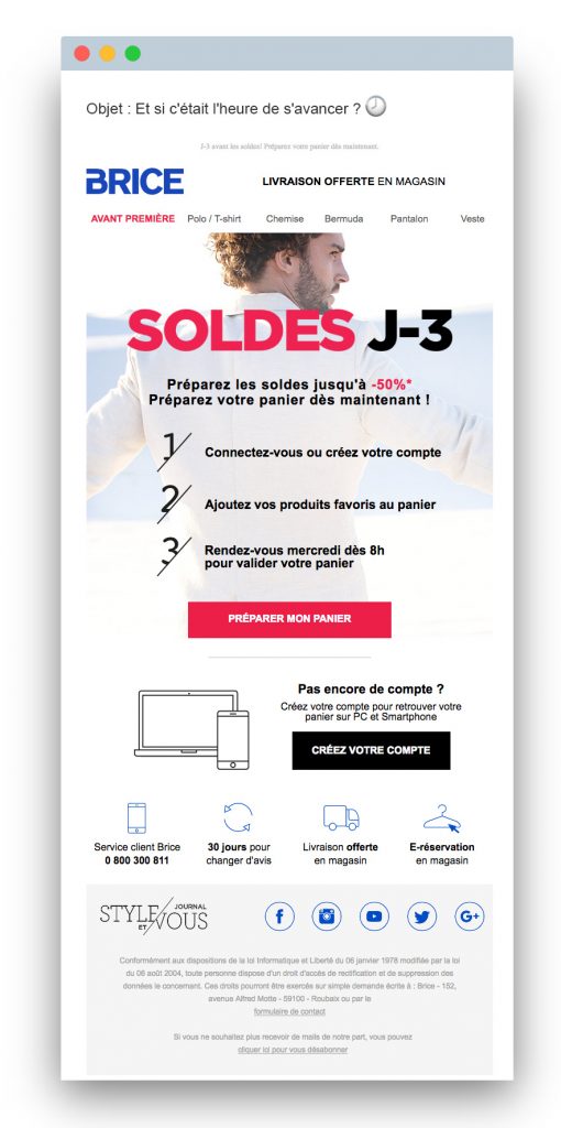
| BRICE | Time to get ahead? 🕗 | 3 days until the sales! Get your cart ready now. |
| LEROY MERLIN | Prepare your cart now! | Get ready for the sales in advance so you don’t miss out on any products! |
| TAPE À L’ŒIL | SALES in 5 days: make your selection before everyone else! | Don’t miss out on your favorite items |
| RUE DU COMMERCE | SALES in 5 days: prepare your cart {FIRST NAME} | Be the first to grab the best deals! |
| LA REDOUTE | 1 day until the sales kick-off: Are you excited? So are we! 😍 | Go straight to the point: prepare your cart now to avoid missing out! |
Play with promotions to extend the interest of your sales emails
As we’ll see below with Hunter’s timer example, sales emails are perfect for using innovative email formats. But you can already be very creative with a “simple” Gif. Proof…
(Click on the thumbnails to view the animations)



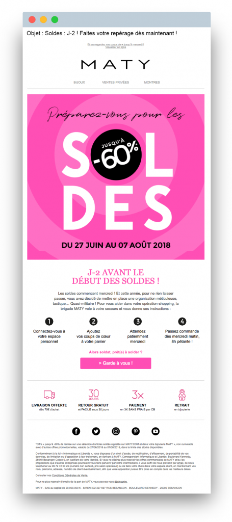
Encourage window shopping: the example of MATY
Subject: Goes straight to the point: reminder of the date (2 days left), clear promise (start your browsing now). Preheader: Effectively clarifies the offer (save your favorites) with a small twist using the heart icon ❤. Top Menu: Simplified to keep the focus on the main visual. Hero Section: Maximizes efficiency: Copy: Allows a bit of playful military language while remaining very clear about the steps to take. CTA: Uses humor and directs to a landing page that reflects the email’s main elements: color codes, instructions for browsing, and preparing your cart. In summary: an ultra-effective sales email that ticks all the boxes of best practices: a clear unique promise, maximum visibility, and a touch of personality.
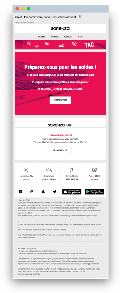
Mixing urgency and reassurance, like Sarenza
Subject Line: Sarenza adds a festive touch with an emoji 🎉, which helps counterbalance the potentially stressful nature of sales. This is a smart choice considering the overall tone Sarenza typically adopts.
Preheader: The preheader immediately highlights the key reassurance element for the e-commerce brand: “Free delivery and returns for 100 days—our great services are available all year round at Sarenza!” This emphasizes that customers have the freedom to make mistakes, whether during the sales or not.
Hero Section: The hero section follows a similar approach to MATY, featuring a helpful Gif. It outlines, in three simple steps, how to enjoy shopping during the sales without feeling rushed.
Copy: The copy goes further by using the sales period as an opportunity to emphasize other persuasive elements: their loyalty program (a secondary promotional benefit), and four key reassurance points (free delivery and returns, variety, and attentive customer service).
Overall, this email is both promotional and relational, effectively reinforcing Sarenza’s main strengths while also driving sales.
2. During the sales: dramatize the dance of the discounts
Even when opened, read, or clicked, sales emails don’t automatically convert. Consumers know the markdown period is long, that with a little patience they’ll get an additional discount… or they may simply have been interrupted.
Email marketing is rarely a “one-shot” strategy, so it’s important to design your follow-up strategy well to maximize its effects. Illustrated by the brand Hunter (the British equivalent of Aigle) and denim specialist G-Star.
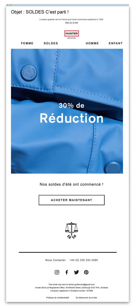
The “Tick-Tock” effect in hunter’s sales email

Two emails, perfectly timed, one on the day the sales begin and another four days later. For a rain boot manufacturer, Hunter doesn’t flood its recipients with messages.
Simplicity also reigns in the design of the two emails: a zoom on a detail, a promotional message, and a CTA. Why complicate things? The first message (announcing the start of the sales) is almost disarmingly simple.
The second is slightly more elaborate, with a clever correspondence between timing (48 hours) and the discount (-48%), and especially the judicious use of a timer counting down the time left before the sales end. A well-executed flash sale operation.
G-Star’s multi-Stage rocket
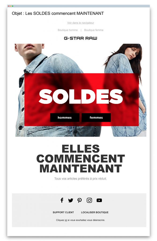
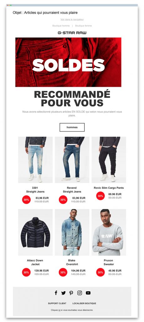
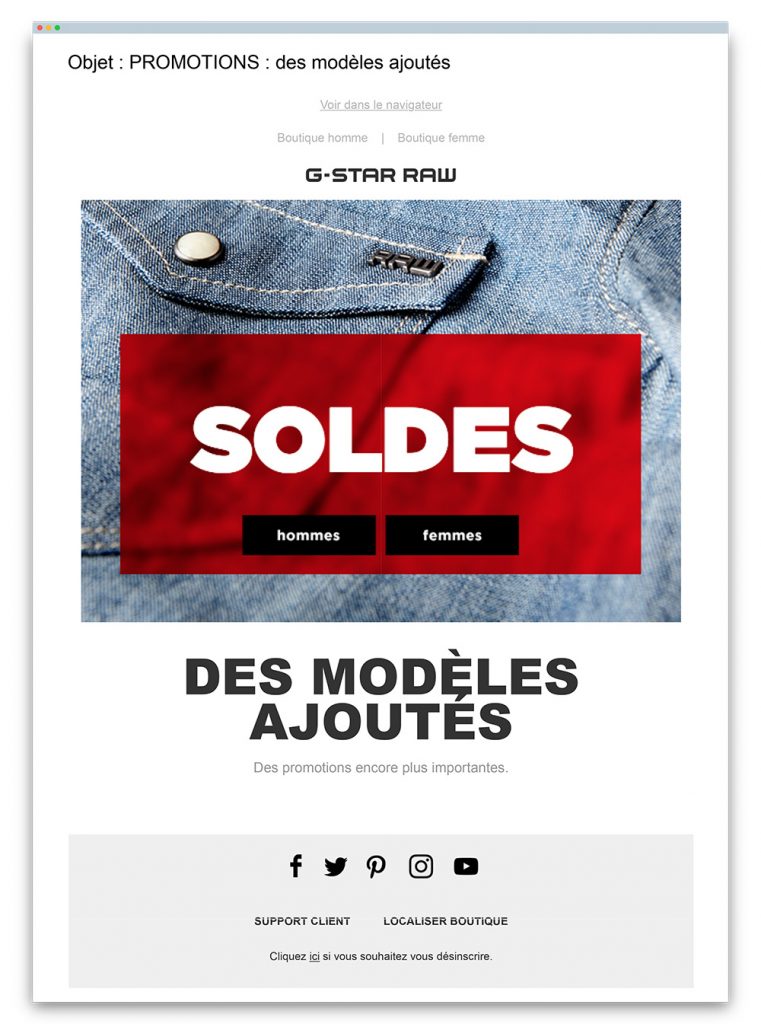
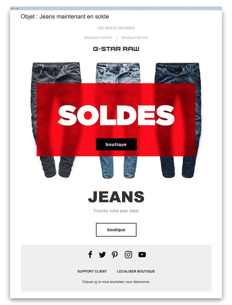
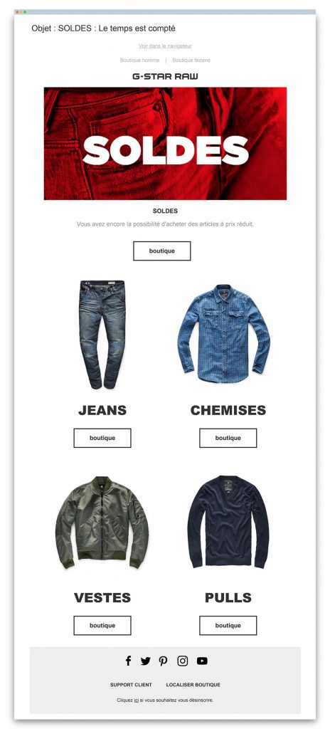
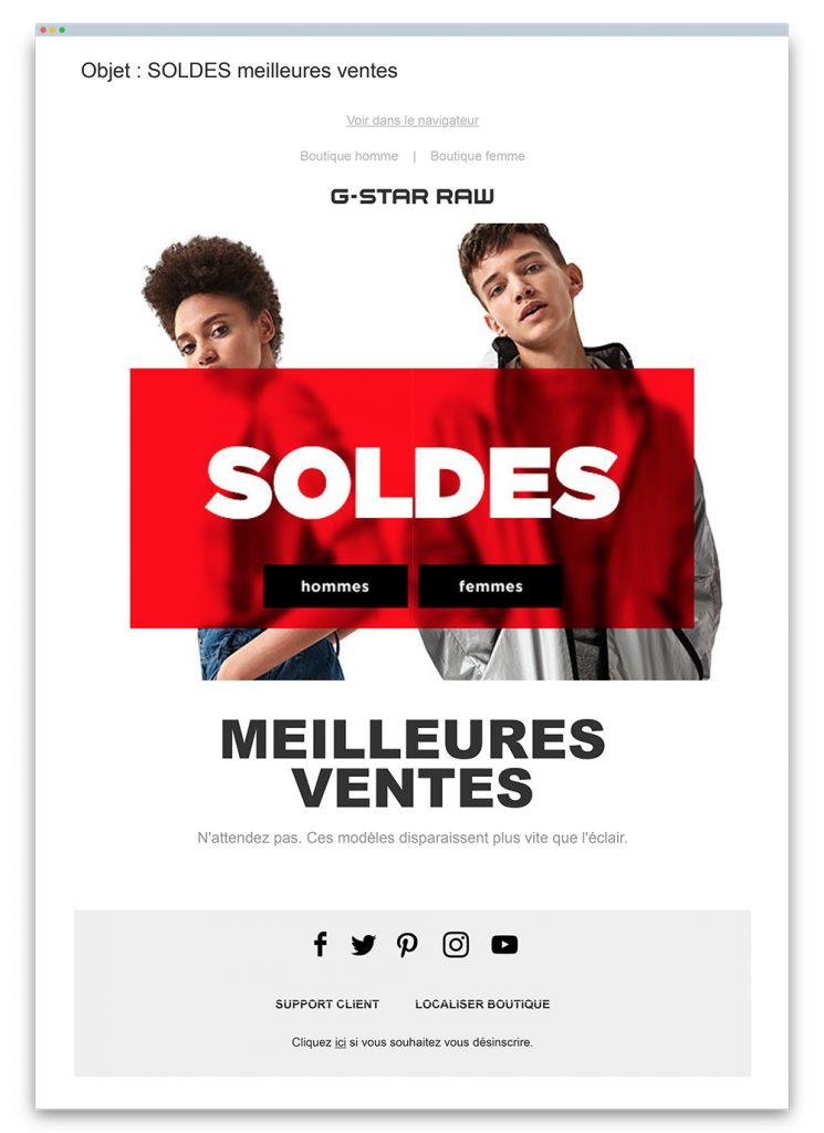
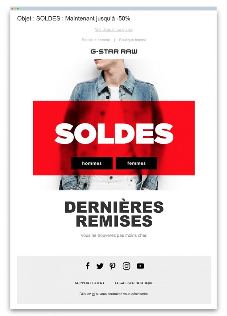
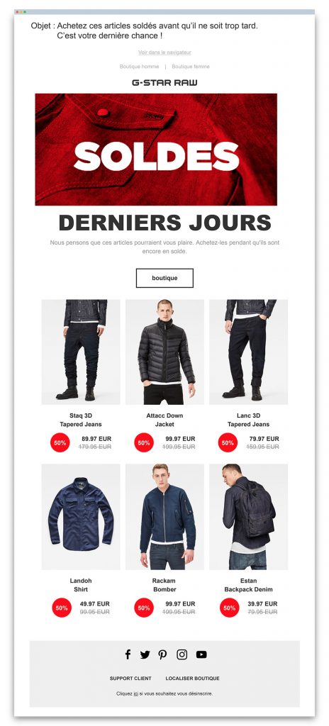
A much more complex sequence at G-Star RAW, with no less than 8 sales emails from day one to day 37. Yet, the clothing brand manages to increase the pressure without tiring the audience, thanks to a skillful alternation between very concise messages and more detailed offers:
- 5 “express” emails (hero, title, subtitle) on day 0, day 5, day 12, day 23, and day 30.
- 3 emails featuring selected sale items on day 2, day 16, and day 37.
In terms of design, G-Star remains consistent, maintaining the same visual identity (red rectangle overlay, bold typography, white buttons with black borders), while alternating images with models or standalone products. The result: emails that stand out and renew interest without veering off course.
And a “dramatic arc” in the messaging that follows the course of the sales, in line with the narrative arcs theory we discussed in a previous article:
- A punchy start (“The SALES start NOW”)
- A more factual and relaxed continuation (“Items you might like,” “PROMOTIONS: new items added,” “Jeans now on sale” for emails 2, 3, and 4)
- A mid-way reminder (“SALES: time is running out”)
- A grand finale with the second markdown email and the “This is your last chance!” closing the sequence.
3. Beyond the sales: an opportunity to give a little more…
Sales aren’t just good deals for customers. They’re also an excellent opportunity for brands to communicate and highlight other services, which may be more lasting and perhaps more engaging.
This is skillfully done by the three retailers whose sales emails are featured below:
- Nike: Uses the “pre-sales” to drive traffic to its stores (in line with its omnichannel strategy).
- Brice: Encourages recipients to open an account and explore its editorial content.
- Nature & Découvertes: Highlights its gift finder service, savings options, and click & collect.





Aucun commentaire pour l'instant