Has the 80s become outdated? Not for Printemps, which designed its summer 2022 campaign with the vibrant colors of this iconic decade. The Printemps email, crafted with Dartagnan, is sure to blow you away!
From Stranger Things to the Top Gun reboot, not to mention the revival of arcade games and roller skates, the 80s are more relevant than ever! Have they ever truly gone out of style? Isabel Marant, for instance, drew major inspiration from this decade for her Spring-Summer 2022 collection, which Printemps is showcasing in an ultra-vibrant summer campaign.
👊 A dedicated product offer
👊 A selection of retro-inspired items
👊 Studio 80 afterworks, and the magic is complete!
👉 Here’s how Printemps is launching its 80s product campaign into orbit!
To complement this stunning marketing strategy, Printemps needed a Dartagnan email bursting with color.
It’s fluorescent, it’s metallic, it’s totally wild, and at Dartagnan, we love it! Bravo Printemps: with you, it’s a guaranteed Back to the Future experience!
1. Dare the 80s Colors to electrify your email
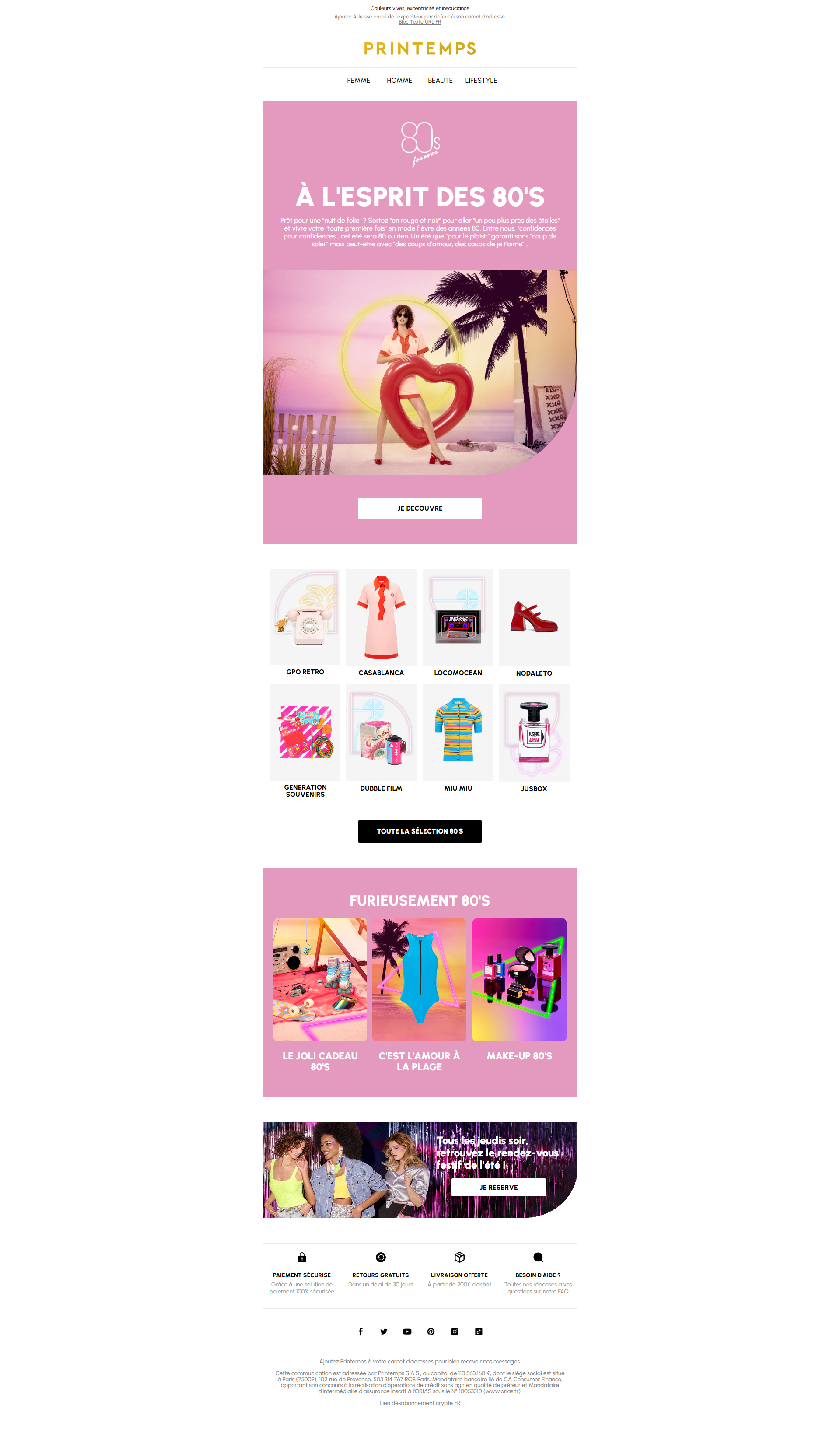
💥 Pink, red, yellow, blue, purple: Printemps boldly uses pop and electric colors in this email, designed like a tangy candy. It’s highly intense, unapologetically bold, it’s eye-catching and may even be a bit overwhelming, but that’s why we love it and keep craving more!
💥 Whether used as a background color in the header or present in product photos, pink dominates. It sets the tone for the email: eccentric and fun, reflecting the spirit of this summer product offer.
💥 Ton-on-ton and pink twilight—almost too much if it weren’t so confidently executed and perfectly orchestrated. The alternating pink and white backgrounds and the use of white in the font balance the color choice while subtly highlighting it.
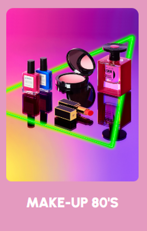
💥 Zip-up bodysuits, roller laces, neon lights in the photos: the fluorescent vibe is present throughout the email.
In an era where younger generations embrace past fancies and the older ones nostalgically savor childhood flavors, this product offer is a little stroke of genius and this email, a true success!
READ ALSO: Discover how Lacoste uses colors to promote its Mobile Wallet offering.
2. Have fun with copywriting to build a fun and colorful universe
An email marketing campaign includes images, product visuals, and CTAs, but it also involves copywriting. The Printemps marketing team clearly had a blast with this, and frankly, we enjoyed it too!
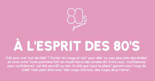
💥 First off, thank you Printemps for this intro that revisits all the French hits of the 80s: from Jeanne Mas to Richard Cocciante, including Gold and Herbert Leonard, the playlist is complete. Personally, we wouldn’t have minded a bit of Rita, but alas, no Rita here. “C’est comme ça aaaaaaaahhhh … lalalala”
💥 The fun continues with a selection of products whose names play with words:
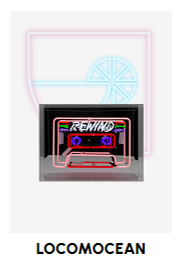
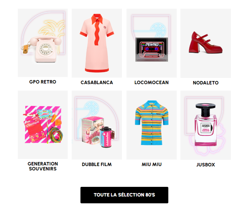
- Locomocean, a trendy neon brand, reminds us of Kylie Minogue’s young years and her famous “Do The Locomotion“
- Dubblefilm rolls offer the promise of vintage-processed photos with a bubble gum taste
- Jusbox perfumes feature a branding where past and future meet to create fragrances with unique accords.
In short, the copywriting of this email matches its aesthetic: “furiously 80s.” Good thing: “We just wanna have fun.”
3. Structure your email as a product selection
Product selection is the foundation of email marketing, but it can be tricky to execute without falling into the trap of a boring product list.
We give a 10/10 for the scripting and structuring of this email, which varies the pleasures and diversifies the offer with much intelligence.
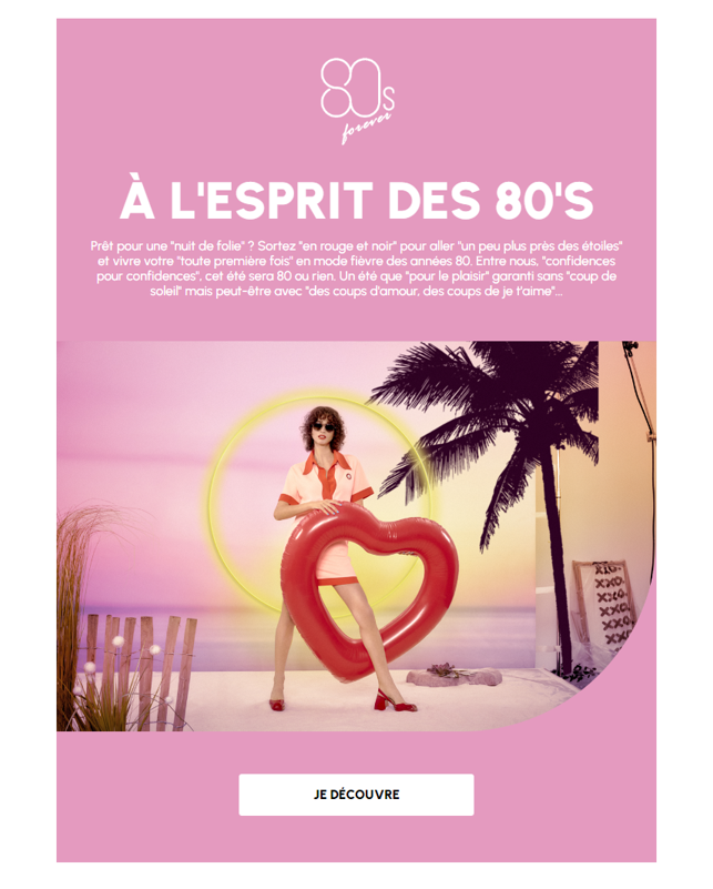
1 – A header in 80s colors
The header of an email is the prime space for showcasing. Printemps invites us to discover the pillar of its campaign: a selection of vintage products styled with an 80s flair, perfectly embodied by the short tart pan collar dress. Set against a delightfully kitschy beach backdrop, this header is a staging marvel.
2. Body – Part 1: the magic of group modules
In the body, we continue with a Dartagnan-made Group module that focuses on a selection of 8 products. Printemps effectively uses the pink and white background contrast between the two modules. However, the reuse of motifs like pink, dresses, shoes, and neons creates a continuity effect. The 4-column groups perfectly align each product and highlight them. It’s well thought out and perfectly matches the 80s spirit with iconic items like the rotary phone and audio cassette present in this selection.
3. Body – Part 2: group module variation
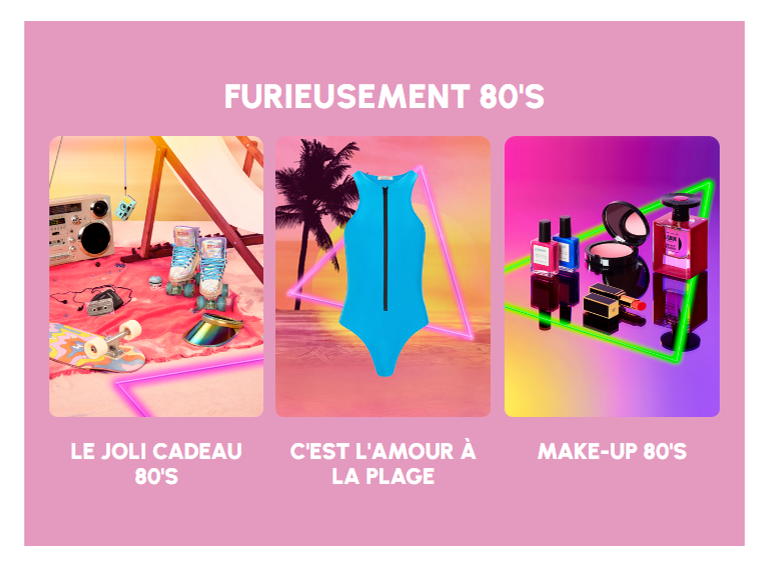
In the third section of the email, Printemps uses the pink background contrast once again. The brand continues with product selection, this time categorized into goodies, fashion, and makeup. Ghetto blasters, metallic visor caps, quad rollers, zip-up bodysuits, audio cassettes, skateboards—everything is there, all within the same kitschy beach vibe. Can someone call us Tom, please? We’d love a little cocktail.
4. Body – Part 3: varying the offer
To wrap up this iconic email, Printemps smartly creates a break in the offer. This final section highlights the 80s-themed events: afterworks featuring DJ sets, cocktails, and karaoke, all with a panoramic view of Paris! Truly nights of madness. This section even borrows from the Début de Soirée music video aesthetic: coincidence or design? Only Printemps will know.

Notably, the structure with a border radius in the image’s bottom right corner mirrors that of the header: a clever design by the Dartagnan x Printemps teams who created modules in their image (here the “P”) and an effective way to structure the email from start to finish.
Congratulations to the Printemps team for this high-color email made with Dartagnan. 🤙 Hey Printemps: your 80s email has got the Look, coco!



Aucun commentaire pour l'instant