
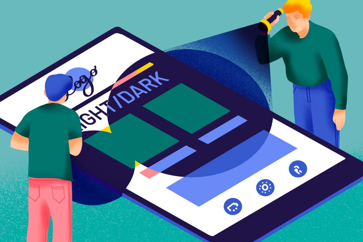
There’s no avoiding it, dark modes are becoming increasingly common in apps… including those your audiences use to read your emails. Depending on the configuration, how does dark mode change the rendering of your campaigns? And how can you make sure they look perfect in any situation?
It’s dark times for our screens these days. Between apps (Twitter, Google Maps, Slack, Instagram, etc.), browsers (Chrome and Firefox) and operating systems (Android 10, iOS 13 and macOS since Mojave), many of the digital environments we use on a daily basis have gone into “dark mode”… including the main email clients and webmail services. Here’s what you need to know to adapt your email campaigns’ graphic charter to this new state of affairs.
Dark mode and email: If you don’t have time to read through everything (or if you’re just checking on the latest changes)Last update : July 1, 2020 Emails en mode sombre : 3 comportements possiblesEmail in dark mode: Three possible scenariosStable (very common) 🔵 Background: no impact 🔵 Text: no impact 🔵 Images: no impact
Dark (fairly common) 🔴 Background: colors inverted* 🔴 Text: colors inverted* 🔵 Images: no impact
Deviant (very rare) 🔴 Background: colors inverted 🔴 Text: colors inverted* 🔴 Images: colors inverted
* Color inversion is like a photo negative: a light background becomes dark, and dark text becomes light, for example. Click here to learn more about the renderings observed in email Dark mode: How emails render in the main user environments
Emails in dark mode on mobile devices
Emails in dark mode on computers
As it now stands, the code and, therefore, the appearance of your campaigns will be truly altered in Outlook 2019 (computer email client) and Gmail (iOS and Android mobile apps), if the user has activated dark mode in the app. “Deviant behavior” is observed in older OSs (but this issue is gradually being corrected, it would appear). Dark mode is achieved in those OSs when the user asks for negative rendering and so expects to see a different appearance… More detailed information is available in this postDark mode : What is it (and why does it affect email)? |
Contents
Dark mode : What is it (and why does it affect email)?
Email in dark mode : The different scenarios
How to adapt your campaigns to dark mode
Dark mode: What’s it all about?
All apps that feature a dark mode give their users the possibility to choose between a light theme (dark text against a white background) and a dark theme (light text against a dark background). This offers a wide array of advantages:
- a more pleasant reading experience in low-light conditions (so the screen is less “blinding”)
- lower battery use, for a longer battery life (confirmed by both Google and Apple)
- reduced visual fatigue (although remains to be scientifically proven).
As a result, dark mode interfaces, a choice that was once confined to techies, is rapidly gaining in popularity: in the space of just a month, 50% of iPhone users had upgraded to iOS 13, an operating system in which Apple is strongly “pushing” its customers to use dark mode.

Email is also affected
What is the impact on email marketing? Well, it is certainly not to be overlooked. First of all because, with six out of every 10 emails opened on mobile devices, the fact that the two most widespread operating systems offer a dark theme makes the issue unavoidable.
But also because more and more of the environments (email clients and webmail) in which emails are read are offering dark modes. Outlook rolled its dark theme this summer, for mobile devices, macOS and Office.com, with Gmail following close behind (for Android, iOS, and webmail via Chrome). At this point, there can be no doubt that this option will gradually spread to most of the main environments in which your campaigns are accessed…
So, the question is not if you need to design your future emails with dark mode in mind. It’s how.
Email + dark mode = it’s complicated
In theory, the impact of dark mode on content is fairly simple: the background changes from light (white or near-white) to dark (black or dark gray). And the fonts go in the opposite direction. Our theory is that dark mode inverts the colors of each of those elements on the color wheel:
- black becomes white
- dark gray becomes light gray
- and a link in blue changes to orange.
But, as always, email is a little more complicated of an environment than the web… The various tests that we have conducted on mobile and desktop environments have identified three scenarios.
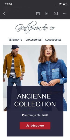
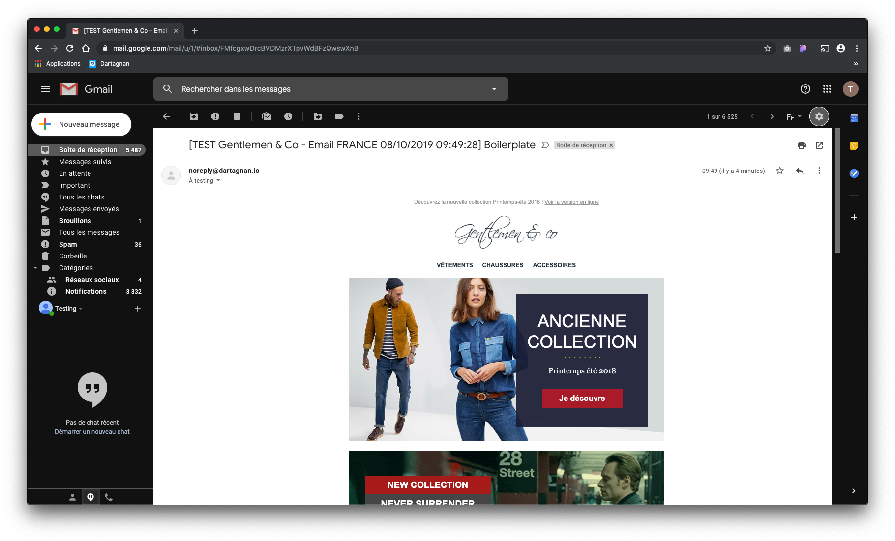
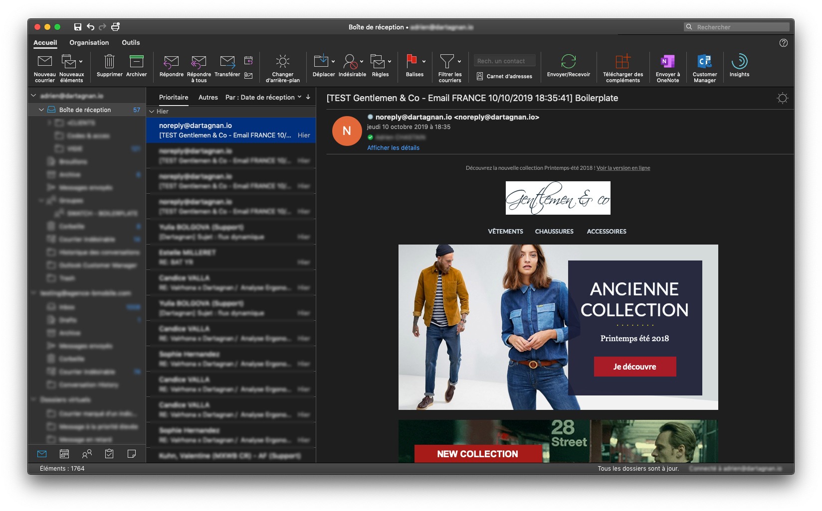
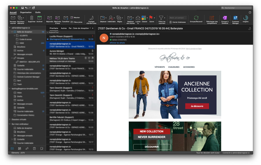
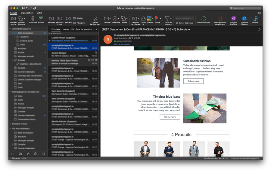
Scenario 1: Stable rendering
The email environment (menu, sidebar and inbox overview) switches to dark mode, but the emails themselves don’t change. This was the most common result in our testing.
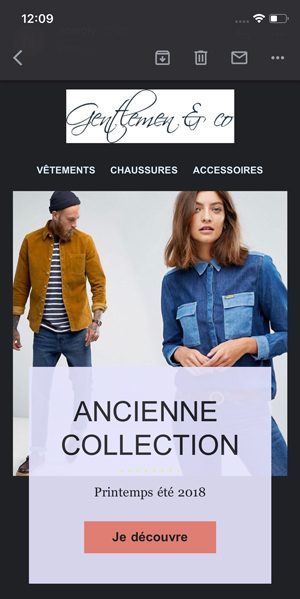
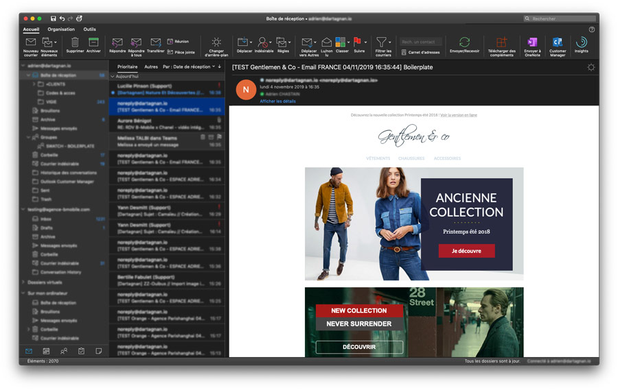
Scenario 2: Dark rendering
In this case, the email adapts to dark mode, with its background darkening and its fonts and a handful of other CSS styles (like threads) lightening. This behavior was chiefly observed in the Outlook app in iOS 13, but also in Outlook 365 for Mac, when the user had activated the “Switch Background” option. More recently (May 2020), the Gmail app (on iOS 13 and Samsung devices) adopted the same behavior. Remember that things can change pretty quickly, so it’s a good idea to test your emails on a regular basis…
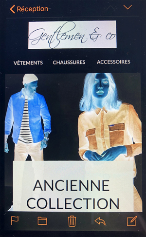
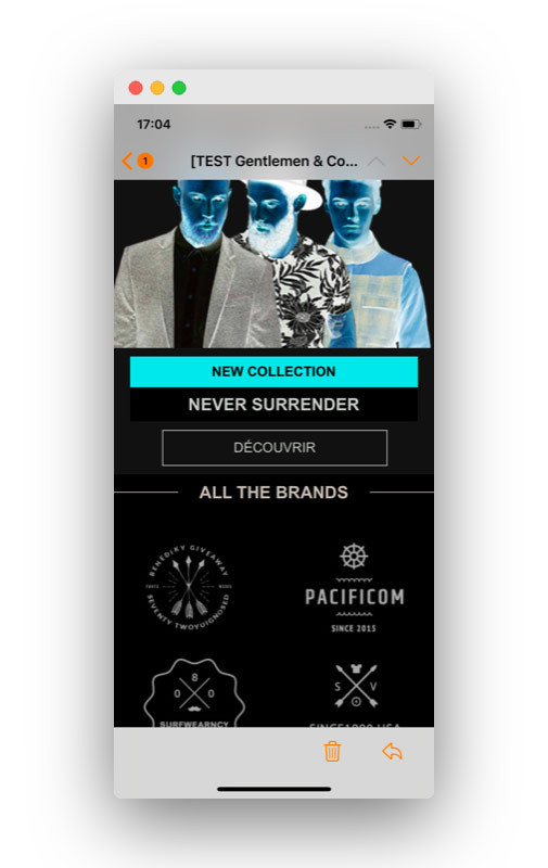
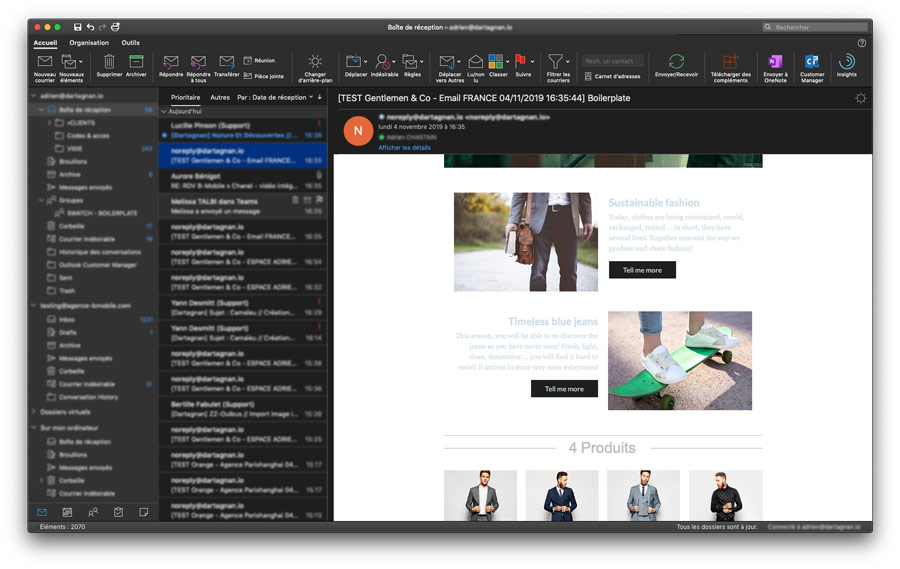
Scenario 3: Deviant rendering
In this case, a campaign’s appearance becomes rather… “special”:
- the background switches to dark
- the fonts and threads switch to light
- and the images… look like photo negatives.
We’re pretty sure you don’t want your campaigns to look like this. Fortunately, this scenario occurs very infrequently. We saw it:
- on iPhones running on iOS 12
- on the Galaxy S8 native app and Gmail app.
And even then, it only happened when the user activated “Invert Colors,” which more or less mimicked dark mode in these older OSs.
Recap: The impact of dark mode on the main email environments
| Mobile
OS |
iPhone
iOS12 and earlier |
iPhone
iOS13 |
Samsung
Android |
| Gmail app | Deviant | Dark | Dark |
| Native app | Deviant | Stable | Deviant |
| Desktop | Outlook | Outlook
Dark background activated |
Gmail
Chrome |
| MAC | Stable | Dark | Stable |
| PC | Stable | Dark | Stable |
How can you adapt your campaigns to dark mode?
Now that you have a picture of all of the possible changes that dark mode can make to your emails, all that’s left is to answer the most important question of all: how can you adapt to this? And how can you ensure that your target audience always enjoys an optimal experience?
There are three possible solutions to this issue.
1. If you want your campaigns to remain unaltered in dark mode
This is one approach you can take, if you want your emails to be displayed exactly as you designed them, with no alterations. So, what’s the fix? It’s fairly simple (at least on paper): you need to force a light background by replicating a white pixel across the entire “surface” of the message.
If you use Dartagnan, this can be easily done by means of a texture. If you don’t (yet) use our email builder, you will have to do a little CSS coding.
On the left is a campaign with a white background texture created in Dartagnan. On the right, you have the same email, displayed in Outlook’s dark mode.
In both cases, you have a stable email, which will not be marred when read in dark mode. Okay, but is this the best solution?
After all, if your recipients have opted for dark mode, going against that choice could prove to be counterproductive, when your bright email assaults their eyes. Because of that, they will undoubtedly:
- close the email
- delete it
- exit their inbox.
In any case, you will not achieve your objective, and your message will not be conveyed.
2. If you want to design emails that get through, even in dark mode
A better strategy would be to design your campaigns so they can be easily viewed in both light and dark mode. Here are some tips on how to achieve this:
- use transparent backgrounds for as many visuals as possible (in .png format), to avoid displaying white “placards” against a dark background
- avoid using visuals with black or other dark solid colors
- if your logo (like so many others) is based on a dark font, outline it in a light color (the same as your background color in light mode), so it stands out correctly in dark mode.
Another possibility, so long as your graphic charter allows for it, is to design your campaigns “natively” in dark mode. This is what Adobe Creative Cloud does, for example… but it’s true that this treatment is perfectly in line with a brand and software (Photoshop, InDesign, Illustrator, etc.) that are naturally in dark mode, to begin with.

3. If you want your emails to adapt to the display mode
True responsive design (the kind that Dartagnan applies to your emails) consists of optimizing an email’s layout, according to the environment in which it is read (by choosing whether or not to display the different elements, arranging them in rows or columns depending on the screen, etc.), to ensure a perfect experience for your target audience.
Similarly, a true dark mode email consists of displaying a campaign in the most appropriate state for the mode chosen by each recipient.
- Light mode? Your email should also have a light background with dark fonts and other elements.
- Dark mode ? Your email should switch (undamaged) to a dark background with fonts that offer sufficient contrast.
Is this science fiction? Not at all! Because there is a media query (a CSS3 module that adapts a web page’s content to the characteristics of the user’s device) that can communicate with the user interface and find out whether or not it is in dark mode.
What is the syntax for that query?
@media (prefers-color-scheme: dark) {
/* Your CSS styles that applicables in dark mode */
}
Here is what this might look like, with a (very rudimentary) example in CSS and HTML:
See the Pen
CSS email – Dark mode by Adrien Guilleminot (@aguilleminot)
on CodePen.
If you want to spend a little more time studying the possibilities afforded by CSS in dark mode, we recommend reading this excellent article from CSS-Tricks.
So, are you ready to start designing campaigns that are equally attractive, by day and by night?
Flawless campaigns in any context?
With Dartagnan, you can easily adapt your emails to be read in dark mode. But not just that. We also offer true, simple responsive design that aligns with your brand identity, plus optimal HTML code.
Discover everything our email builder can do for you!Haut du formulaire


Aucun commentaire pour l'instant